Tag: home decor

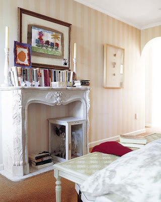
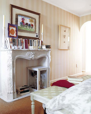
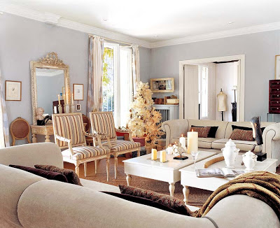
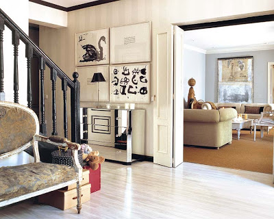
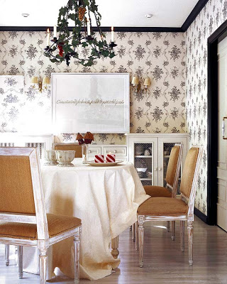
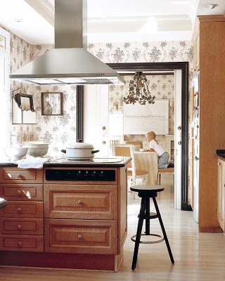
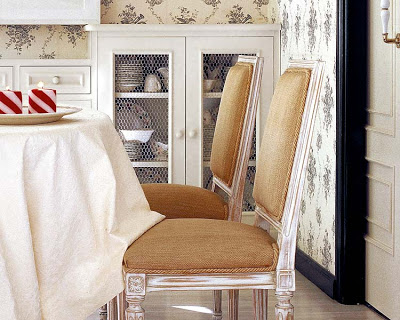
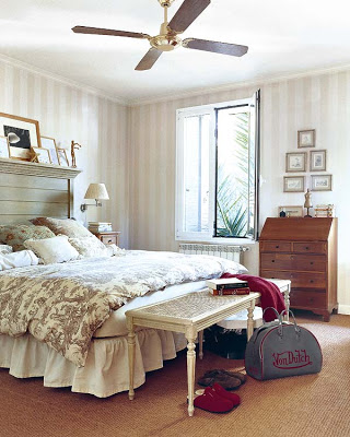
This Spanish abode used to be two separate houses that the owners fused into one with the help of an Architect. The now spacious rooms were decorated by the owners and I should say I love the feeling of just the right amount of seriousness and country feeling they accomplished. The same color scheme can be seen around the house bringing serenity. The patina of the unfinished wood of the furniture gives that country atmosphere that the owners seem to prefer.


All images via Micasa.

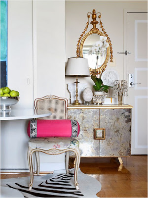
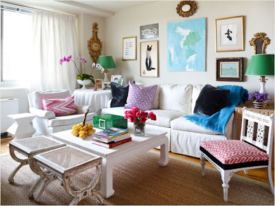
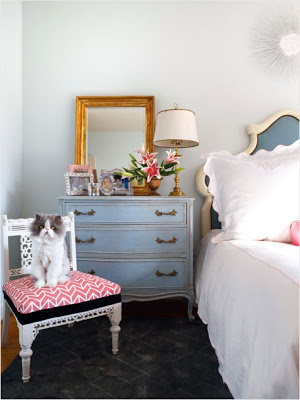
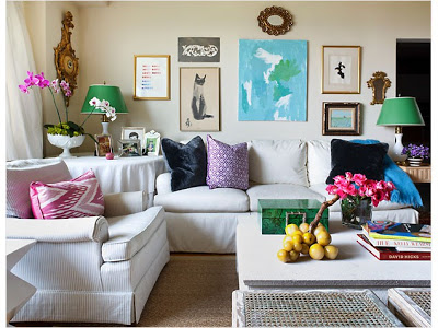
I came across this very feminine and stylish home this morning while visiting iVillage. It belongs to designer Sara Tuttle and I love the use of pink tones mixed with gilded accessories and mirrored furniture throughout.

All images from here.


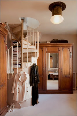
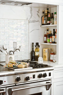
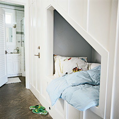
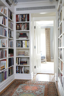
Storage, storage, storage is all we covet sometimes. Storage is something we can never get enough of, especially when we never stop buying or starting a new collection. When there is no empty floor space to add onto; going inside the walls, under staircases, or even adding a shelf over a hallway door is a smart way to go.

photo by Jon Jensen via Coastal Living

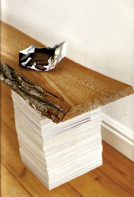
Love this idea of using books or magazines as bench legs.

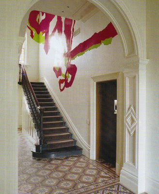
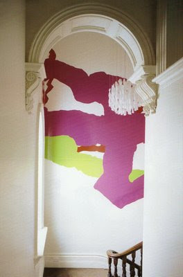
I believe that when there are children in the house the approach to decorate a house is based on safety more than anything else. Things like rounded corners instead of pointed ones, easy access to toys and keeping lower kitchen cabinets locked among other things are to be considered. But i also think there is a fun part that should be included when decorating a home with kiddos. Especially because personalized and unique homes could lead to creativity and individuality in your child. Things like stencils, geometric wallpapers or just a chalk wall would be a great way to inject that fun part in a home. I love all these images below and one thing I know for sure with a cool house like one of these below your kid will be the coolest kid in the block.


two top images via Vogue Living Australia.
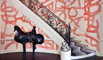
Kelly Wearstler’s grand foyer

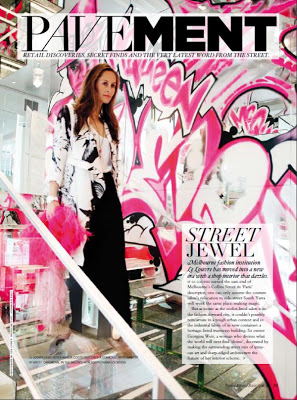
Melbourne Fashion Institute Le Louvre via Vogue Living Australia.

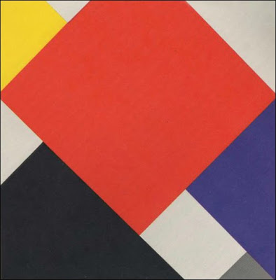
I’ve been taking a class on Decorative Arts after 1800’s and I have to say that even when I’m not a big fan of Cubist influenced paintings I’ve being strongly influenced by Stijl’s style and its ideas of universal unification that makes me seriously think about doing something crazy with my foyer walls based on this particular style. Perhaps it would not be only horizontal and vertical lines, but would be a little bit more curvy here and there in a more monochromatic scheme.


A Theo van Doesburg painting.


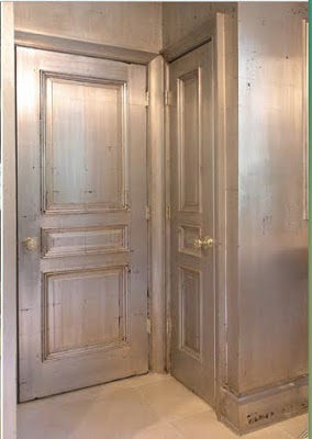
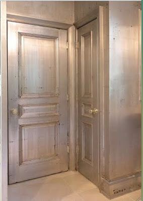
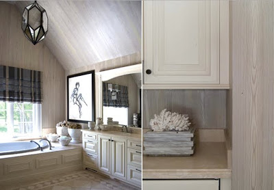
I met the Design Red team at the Architectural Digest home show early this year and was very impressed with their fine decorative painting work. “Design Red is a Chicago based firm that specializes in fine decorative painting, with a commitment to excellence in craftsmanship on every project, and is known for extensive experience, highly skilled artistry, innovative style, creativity, and distinguishing detail. Named by Chicago Magazine for “Best Faux Finishes” in 2007, DesignRed’s clientele include prominent interior designers and architects, and private individuals.” Some of their work can be printed as wallpaper and delivered to their clients making the process more personal and easier. Below are samples of their work. I can only imagine how much work and effort it takes to get these kinds of results.
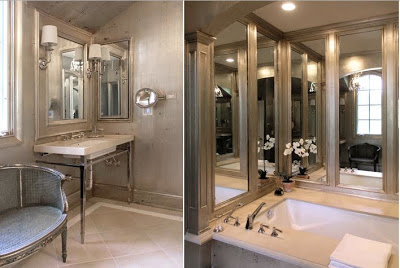

This bathroom looks as glamorous as it can be with antique gilding technique.
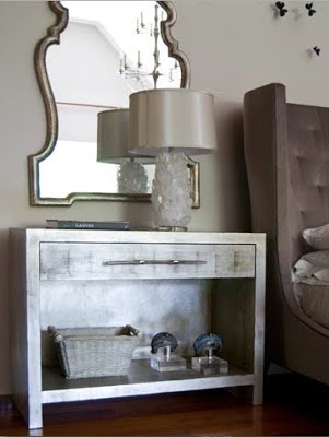
One of two side tables that were gilded then burnished and detail of an antique gilded bathroom.
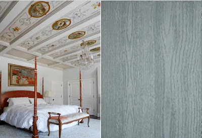

Hand painted ceiling panels in a French Beaux Arts design and detail of blue faux bois.
I love the Faux bois in this bathroom.
 
Bronze gilded ceiling and dressing screen gilded and hand painted with Modern design.
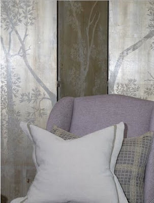
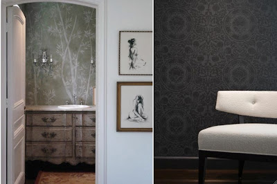
Hand painted chinoiserie wallpaper and black-on-black stenciled wall.
Enjoy your weekend!!