Tag: interior architecture

resurgence in classical design

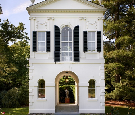
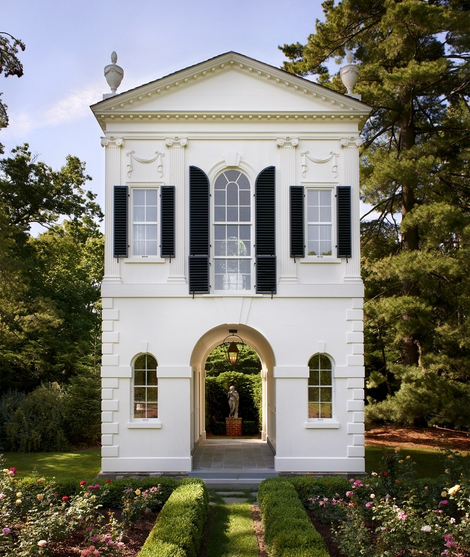
To our delight and comfort, there is a resurgence in classical design from Interiors to Architecture.  The elegance and comfort that classical homes provide are hard to emulate in a modern setting.  Classic Architecture, as well as classical Interior Design, is never dull, and they provide a sense of belonging and gracious living.  Now when most homes in social media look strikingly the same, it’s very comforting to see this revival of new classical style.  The beauty of a Georgian Home, one of many traditional styles in Architecture, is indisputable.
resurgence in classical design

Recently I came across this very interesting article Inside Architecture New Classism Boom.  In designing a northern California stone house for clients who wanted to make a grand yet livable house for four children, Eric J. Smith—who collaborated with legendary designer David Easton for 25 years—looked to Irish Georgian houses and also old stone houses of America. An abandoned old quarry in Connecticut was the source of stones with a rich patina. He points out that classicism embraced the use of natural light and the prevailing breezes. “An enfilade of natural light connects one room to the next,” notes Smith. The paneled library is a masterpiece of wood carving. And indeed, Smith suggests that craftsmen are unsung heroes in classicism. “We are not embracing the role of the craftsman as much as we should,” he says.  “We are always trying not to copy the past, but to interpret it and reinterpret it as artists often do,” Robert A. M. Stern
resurgence in classical design, gray appartment

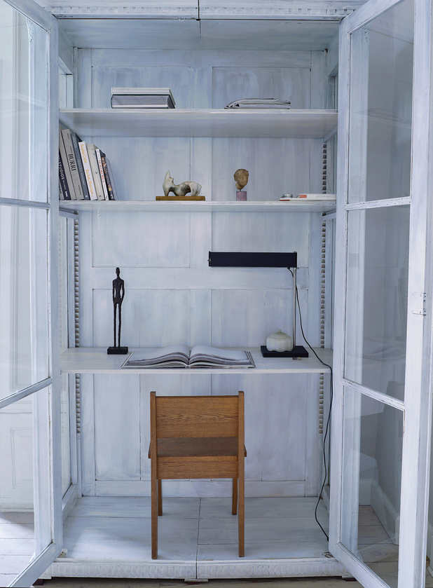
Some people prefer to combine classical Interior Architecture with a more straightforward decor.  Modern living in a traditional interior.  That is the case with this 18th-century architecture apartment in Copenhagen which is decorated in a monochromatic palette of grey and simple furniture.  An All-Gray Apartment That’s Not Blah, But Not Hygge Either. Read More…

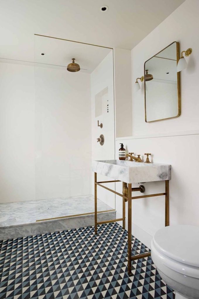
If you are considering using patterned cement tiles in your home, whether as a kitchen backsplash or as floor tiles, in your bathroom, and are doubting whether or not cement tiles will stand the test of time.  It’s good to remember that few other tiles have been around for so long and still keep coming back strong every now and then.  They are super popular right now, especially in kitchens and bathrooms.  They quickly transform any blah room into a wow one.  Another excellent characteristic of cement tiles is that because they are handmade no two tiles look exactly the same.  This characteristic makes them authentic and gives them a feeling of originality.

There are so many patterns available by different manufacturers that is almost overwhelming.  I’m sharing a few sources at the bottom of this post.  Whatever patterned tile you decide on,
one thing to keep in mind is that you should follow installation instructions to the T, especially when it comes to the final sealing step.  Cement tiles are incredibly tricky, and they can be damaged very easily.  They can get stained, not precisely a beautiful patina and these ugly
stains are very difficult to fix.  Manufacturers are usually not responsible for any stain developed after improper installation because they stand behind the fact that due to the nature of the cement tiles being made by hand they are prepared to look imperfect.  The truth is that a beautiful patina on a tile is not exactly a stain, that’s why it’s so important to make sure that your installer is doing the installation correctly.

cement tiles, encaustic tiles, bathroom with cement tiles

If you are installing them on the floor as in this beautiful bathroom above, make sure the floor is level; otherwise, the tiles can chip off with usage over time.  The chipping may be due to the way the tile is manufactured in sort of layering.   Another widespread use of encaustic tiles is on patio floors,  and they can look great in the right kind of architecture.

Read More…

Townhouse, interior design, contrast

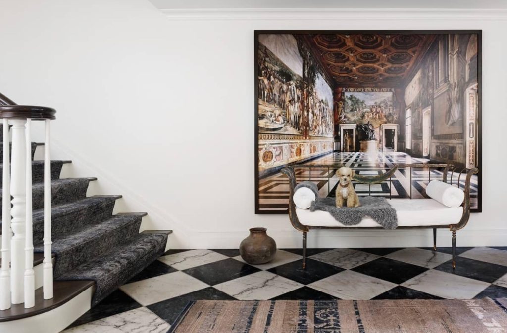
Classic elements are combined in an unconventional way in the entryway of this Upper East side apartment.  The carpet on the staircase is a hand-patched antique runner.

When I saw this house a couple of months ago in Veranda, I knew I was going to post it one day.  Its full of contrast, glam, creativity, and elegance.  The latter is done in a very subdued manner, not over the top but with an evident refinement.  The house was fully renovated by architect Nate McBride in collaboration with Interior Designer Alecia Stevens.  Among the significant structural changes is the fantastic row of steel casement-windows which open onto a terrace on each floor of the house overlooking the beautiful garden in the backyard.  The townhouse shows a great balance between classic, modern and glamour.

Read More…

Architect Peter Pennoyer transformed this 1857 New York City townhouse after the interior has been altered too many times.  The building or the townhouse is a four-floor Italianate redbrick building in Greenwich Village which had been previously converted into separate apartments and as a consequence many of its original features and layout had been removed.  The owner of the townhouse enlisted Architect Peter Pennoyer for the major undertaking of the Interior Architecture and Shawn Henderson for the Interior Design.  Pennoyer is known for his elegant classic aesthetic “I usually like to keep the old materials, the beams, at least,” the architect says. “But this was unsalvageable.”  as told to AD.  And so it all began on a three year renovation project to restore the single family home and bring it back to its original beauty.  The serpentine staircase illuminated by a skyline is the master piece of the renovation and it was further embellished with subtle texture and flecks of silver leaf added by Henderson over its white plaster walls.  To see the before pictures of this impressive transformation go here.

Peter Peter Pennoyer livingroom Shawn Henderson

This living room is the epitome of glamour, from the color scheme and the art work to the furniture selection.

Read More…

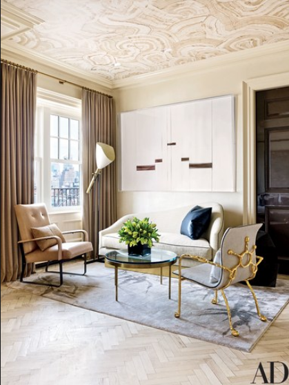
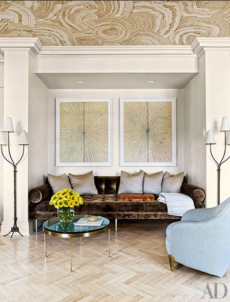
This penthouse in Greenwich Village, New York has all the details of a jewel box with the exception of the jewel tones. Well perhaps you can see one or two. The inspiration for this glamorous and elegant apartment was two chairs but specifically two beige chairs that Interior Designer and Architect Rafael de Cardenas found in Basel, Switzerland. The owner is a London born who moved to New York and whose taste is obviously urban and sophisticated. Although the apartment had been redone previously and was in good shape, Cardenas and its owner decided to make it even better and more appealing to its owner’s taste. Walls were moved and every surface was refinished. The color scheme throughout the apartment is mainly composed of neutrals with lots of pretty details and different metal finishes. Metals such as brass, bronze and steel work as jewelry accessories against the blond-wood herringbone floors and the travertine fireplace. The fireplace has a glamorous brass mantel… or is that painted to look like brass. Either way it creates an alluring effect.
Rafael de Cardenas Interior Designer via belle vivir interior design blog

A Mattia Bonetti chair on the right.  The sofa is designed by Rafael de Cardenas

Interior Designer Rafael de Cardenas living room via belle vivir blog

Brown and blue is a combination that I have always favored.  The day bed is custom-designed by Rafael de Cardenas, the lamps are by Jean Royere.

Read More…

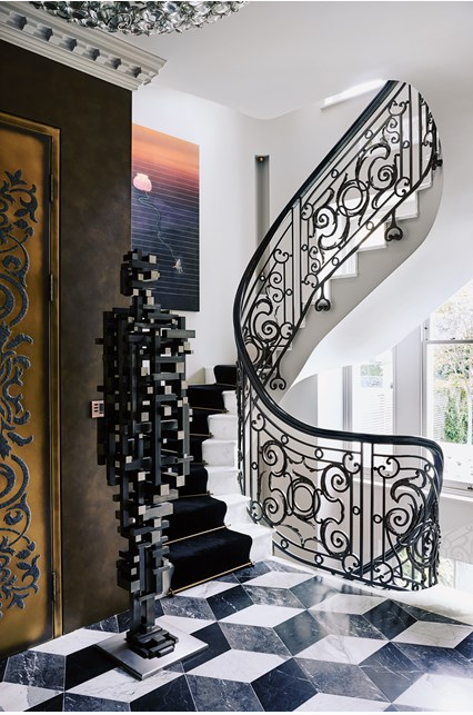
When designing a home around contemporary art, especially if the art is an impressive one, the house should rise to the occasion in more ways than one.  In this case the owner of this Victorian house in London owned a dramatic collection of contemporary art so instead of creating a home that recedes to the background, Architect and designer Shalini Misra created a home with drama just enough to not shy away from the art and with character enough to serve as blending element.  The result is a balanced combination of drama and glamour.

designing a home around contemporary art by Shalini Misra via belle vivir blog

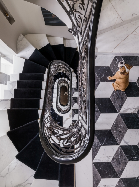
A mixture of black and white play a protagonist role in the Interior Architecture.  The contrasting colors are beautifully used.  We can see them on ornate stair railing and on the Rhombus pattern tiles on the raised ground floor.  The transformation of the Interior Architecture was pretty impressive and left only to professionals.  Since the house needed to be enlarged to accommodate the owner’s art collection, doorways were widened to facilitate the view of the art.   The basement was dug deep to create an extra 418 square meters for a swimming pool, gym and spare rooms.  As well as the staircase was relocated to move clockwise between all floors.  This last move was inspired by Vastu Shatra principles- a traditional Hindu system of architecture meant to bring harmony into the home.

designing a home around contemporary art via belle vivir blog

How amazing is this impressive view of the staircase.  Beautiful white marble, velvety stair runner and ornate railing combined with an edgy but still traditional rhombus floor.  It’s a somewhat over the top interior design.  Though a kind you can live with thanks to the classic references and neutral tones.  I say, I’ll take it.

Read More…