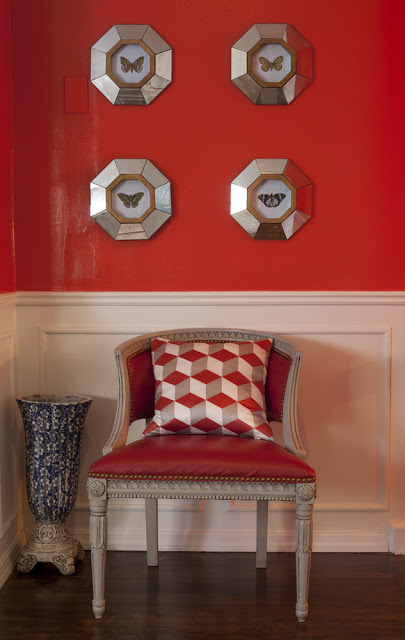
My small foyer Photographed by Robert Levi
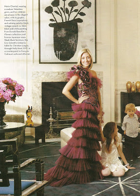
Marie-Chantal poses in front of a Donald Baechler. If anyone out there wants to give me a gift, please make it a Donal Baechler painting. Thank u 🙂
Today we are going to discuss The Characteristics of Georgian Homes. But, first, I have the great pleasure of introduce you to Vyna St. Phard the mind behind High End Weekly, a blog dedicated to the highest standards of luxury lifestyle. Vyna is a New York-based interior designer who draws her inspiration from culture, fashion, art, travel and nature. Her aesthetic style is greatly influenced by the Art Deco style and Bauhaus movement. Her daily posts cover everything from, of course, Art Deco, the luxury market, and lifestyle blogging. Raised between Paris and New York she speaks perfect French and what I love more about Vyna is her bonne vivante personality and how easy going she is. I asked Vyna to contribute to Belle Vivir and share with my lovely readers some of her extended knowledge. Thank you Vyna for accepting.
*********************************
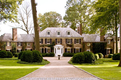
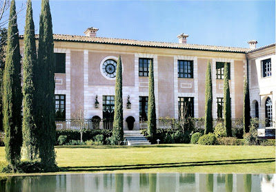
Here’s a quick rundown of the history of Georgian Houses. They were built in a style that was popular in England from roughly 1715 to 1830, during the reigns of the four King George. The Georgian style homes are noteworthy for their distinctive appearances and for the influence they still have on modern building styles which is why I’m especially fond of them.
Read More…
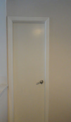
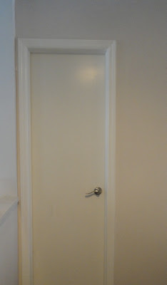
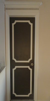
When we first started remodeling our home, one thing I regret is not having opened up the doorways. I’ve always loved big, tall doors, but being just one month due from having a baby all I wanted was to move in and wait for that day without any hassle. With that in the back of my head I always knew I was going to do something to my doors to make them look their best. I crowned them, literately. It’s a simple and very affordable way to add interest and value to your home while enhancing the architecture. I also painted them in a dark gray color and painted the molding silhouettes.
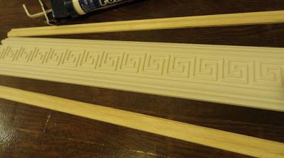
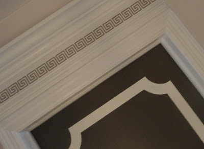
I chose a 3″ Greek Key as part of the crown molding, but they were not too visible, so I painted it with a mixture of two colors, the door paint and the molding paint to make it lighter.
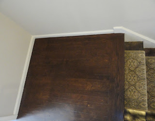
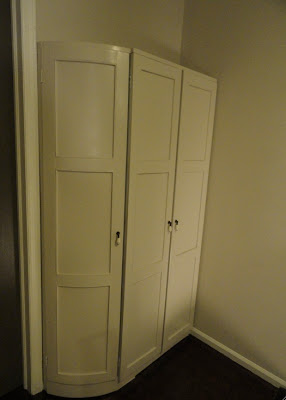
When there is not enough storage space and no additional space to expand, look at the corners and turns in your home which are usually not utilized. I had this closet custom built on the landing of my stairs and it didn’t take any extra space from the walking area. I painted it the same color as the wall to have it blend in and the outside corner was done with a curve for free passage. The new one became the linen closet and the empty one became an additional clothing closet we didn’t have before.
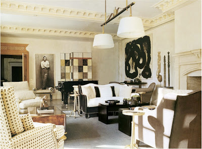
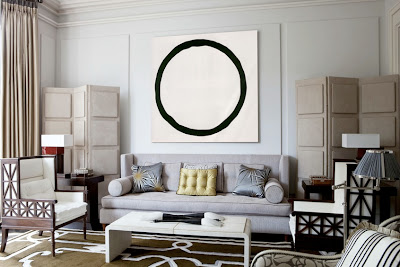
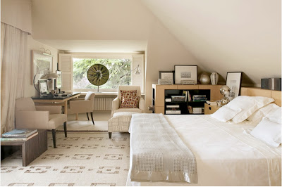
Thomas Urquijo, a Spanish Interior Designer or Interior Architect I should say, is one of those masters who knows how to mix periods and style in one of the most effortless ways I’ve seen. His Interior Architecture is completely classic and elegant but it feels totally livable. It doesn’t make me feel stiff at the thought of living in it.
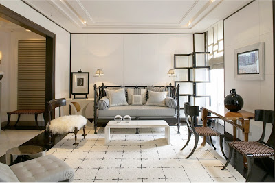
Love this area for a small apartment living room. The architectural screen and the treatment on the walls brings personality to the room while the daybed and the kind of modern or transitional carpet makes the whole atmosphere feel friendly. The Klismos chairs make a direct reference to classic in a very light and chic way.
Thomas Urquijo seems to love regency and art deco style furniture, which I would say helps his rooms look transitional. I feel I can never get tired in these rooms.
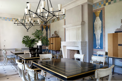
Here, in this amazing dining room, Thomas went completely regency. He painted Egyptian figures on the walls and used a more modern version of the Klismos chair. I adore the checkered border on the upper part of the walls. It’s amazing how a simple little detail can bring so much character into a room.
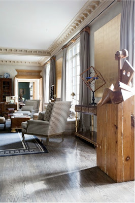
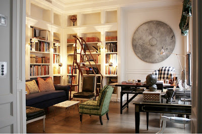
This room has me drooling…. I mean seriously drooling. I can not tell you how much I adore that ladder, does it look a bit Art Nouveauish to you? I have to have a Louis XVI chair upholstered in black leather one day. I know, I know… Check out the circle sculpture on the wall! Can you picture a square one…? nah… The gingham checkered fabric on the wing chair brings a touch of youth to the classic library.

