never get tired instead always inspired. Enjoy!
never get tired instead always inspired. Enjoy!
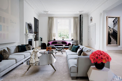
Some people are fortunate and others are even hiper-fortunate. No, I’m
not referring to Oprah and by no means I’m implying that fortune comes as
a celestial gift, rather that it is a result of continuous hard work. I’m
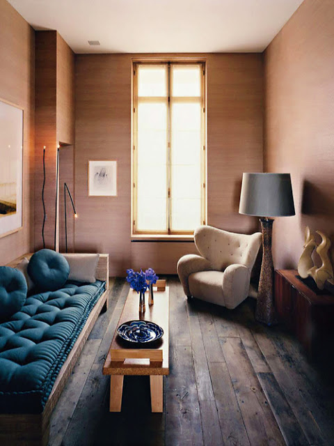
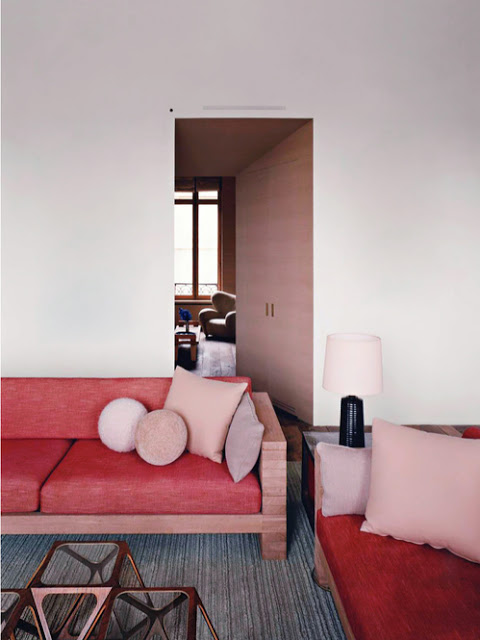
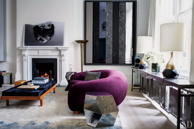
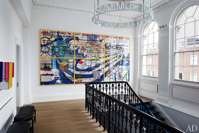
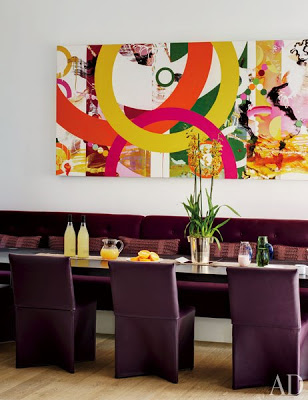
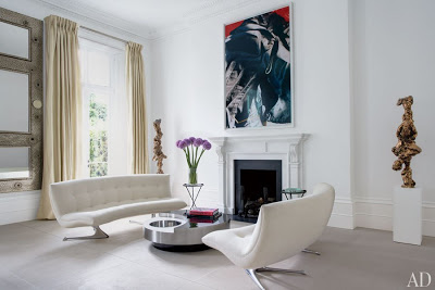
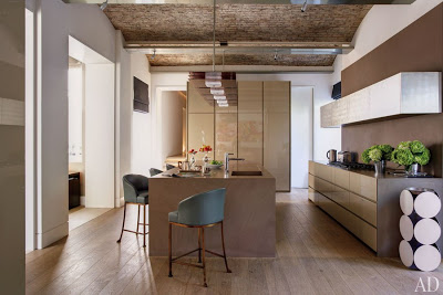
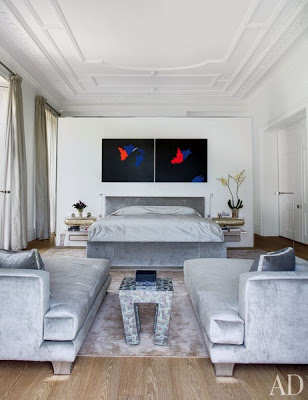
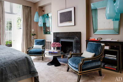
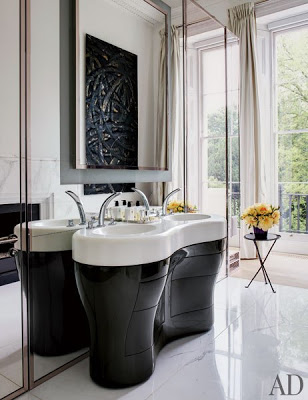
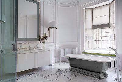
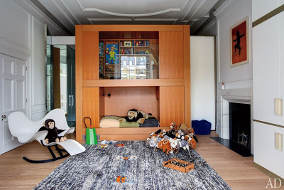
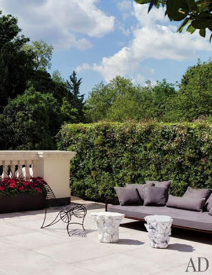
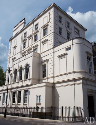
referring to the owners of this gorgeous townhouse in London, designed by Francis Sultana.
Featured in the latest edition of AD, this townhouse’s mayor challenge is its
big size. The owners who are avid art collectors wanted to create a home
for their family rather than a museum. And boy, did they accomplished
it! Enjoy!
is in like a sculpture.
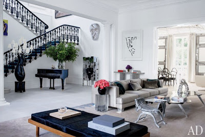
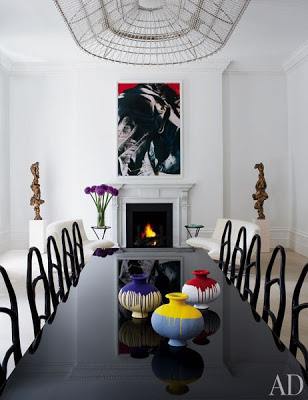
The dining room, above and below, with two Vladimir Kagan white sofas and
Bonetti chairs around the table.
room.
All images vi AD
Few design techniques can transform a room as the enhancement of its walls. Wall treatments have never been so exiting and unconventional from highly crafty fluted plaster walls to artistic pyramid paneling walls, architectural motifs that were accredited for exterior texture and furniture have been forever moved inside to residential interiors in never-seen-before ways. Most of the time the effect is so impressive and powerful that little else is needed to complement the already aesthetic walls. The more traditional methods such as the ones used in the first four rooms, fluted walls, are not an alternative for DIYers. It is a skill to leave only to professional hands. The more modern texture walls such as wood block stacking, tiling and origami would be an easier choice for very clever, handy home owner. For more easy way to add dimension to your walls you can go here.
Fluted plaster walls are spiced up with paint and finished up in a curvature a few inches off the ceiling. I love the round endings, top. Designed by Jean Louis Deniot via AD.
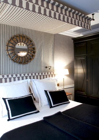
To many people, the thought of a canopy bed would give them the creeps. Not to blame them if the first image that easily slips into our minds is a frightening postcard from The Jacobean period style. A heavily carved gilded bed with a heavy cornice, swags hanging from the canopy and so much fabric enclosing you is for sure a recipe for rhinitis. Today’s canopy beds couldn’t be farther from that and you don’t need a four-poster bed to create one. Anyone with a regular bed can build one with curtain rods and fabric securely hanging from the ceiling. Check out YouTube for some cool tutorials or head over to Lonny Magazine where Michelle Adams documents how she made hers.
Whichever way you decide to make one, a canopy over the bed is one of the most romantic ways to decorate your bedroom. The design of Modern Canopy Beds nowadays is a far cry from the times of its origins. Back then, the design of the Four Poster beds was heavily carved dark wood and always enclosed with heave curtains. As life got easier and lighter with times so did the Canopy Bed hence their posters are slimmer with cleaner lines. They are easier to decorate with than many people think due to their unique dual design advantages. Surprisingly these particular beds can make a small room look taller and bigger while they also can complement beautifully bigger and higher ceiling bedrooms.
Four-poster beds also come in mirror for those looking for glam. Enjoy this round-up of modern canopy beds in case you are in the hunt for one and while you are it, take a look at the many canopy bed ideas.
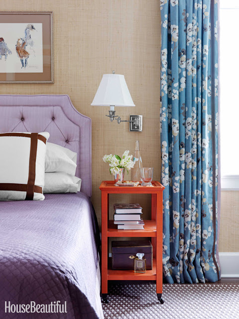
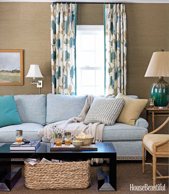
I’m happy to have been contacted by House Beautiful to write a post on Grass Cloth a week ago and very honored for the mention that will appear in the December/January issue. If you have an iPhone you’ll be able to link to Belle Vivir through the HB Connect app. It’s amazing how dynamic and personal magazines have become. House Beautiful was kind enough to send me the article so I can see it and new watermarked images that will appear in the December/January issue. Kevin Isbell knew how to make this1930’s center-hall colonial home current by injecting warm and intrinsic details such as geometric trims to floral curtains, gross-grain ribbon tape to a plain white sofa and visually connecting two separate rooms by custom painting grass cloth walls the same color as the ceiling. “Grass cloth has a warmth that paint does not, and darker colors are more cocoon-like” Kevin Isbell.
I love the contrast between the modern looking cocktail table and the wicker basket in the family room. Notice the detail of the tape on the sofa. It’s all in the small details that slowly reveal themselves to you. In this room the grass cloth used is a bit more textured than the one used in the bedroom above. A very applicable difference, I think.
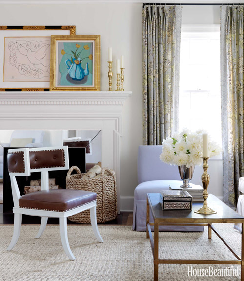
You know how I feel about any klismos and klismos influenced chairs. It’s forever my favorite chair. And the contrast here between the lilac slipcovered chair and the leather brown on the klismos chair is the perfect union of masculine and feminine. I didn’t want to spoil the article so I’m only posting the three images above, the two below are from Isbell’s website.
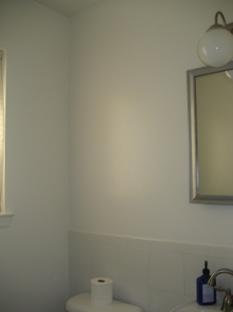
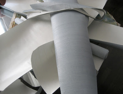
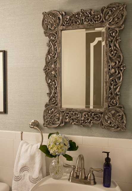
Our powder room was the only bathroom that didn’t get gutted and redone. It would’ve been a lot of fun. This is usually the place where designers choose to go wildest. Maybe in the future we’ll do. Although I have to admit that’s far from happening. The only thing that came down was a ridiculous vanity cabinet, I don’t thing we need a medicine cabinet in our powder room? To our timing all this bathroom needed was wallpaper, in this case the remnants from Lucas’s bedroom. Didn’t I get lazy here? That’s the beauty about seagrass wallpaper; it is highly forgiving due to lack of a pattern, and the natural texture of the grains fit flawlessly together and it also hides many imperfections on the walls. Since I’m a little bit useless when it comes to DIYing, I hired a professional to do this, even when he was dealing with remnants- which is exactly the reason why I did it. The wallpaper was installed in thee of the walls and the one across from the mirror and toilet has a gallery wall from floor to ceiling. The result is totally flawless, even I can’t tell where the seams are. Go ahead don’t throw away those remnants! Below, how to transform a powder room with wallpaper remnants.
This is the after shot. The mirror is from Anthropologie and the towel is Pratesi, bought at a sale.

