Images via here here & here.

Images via here here & here.
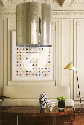
It’s all in the details! It’s the first thought that came to my mind when I first saw this home. I’m a constant admirer of anything related to interior architecture. Only a few things inspire me more than Architecture itself. And, God, this house is certainly one with exquisite architectural details that make these rooms shine by themselves, from the ornate coffered ceilings, clean boiseries and Greek key moldings to dark wood floors. Of course its owner, the couturier Howard Green is no novice when it comes to style. He knew how to pair this splendid home with equally sculptural pieces and show-stopping art. If this home appears to you like a French home, it is, because Paris is Howard Green’s favorite city. No wonder!!!
All images scanned by Escapade.
Even the masters don’t stop remodeling and making changes in their homes and offices. This is obviously the case with anyone who loves and/or is involved in Design. When I saw the office of Bunny Williams featured in the current issue of Lonny Magazine I couldn’t help notice how her office has gone through a major transformation from the last time I saw it in her website. This time her office has a more Scandinavian vibe than the more Roman/classic influence of the previous design. New white bookcases make the room lighter, brighter and younger and that yaw dropping Swedish bed corona above that table give another life to the ceiling.

Lately I can’t get enough of masculine interiors. Perhaps it’s because I’m working with a golfer gentleman who is very classic and has an elegant taste. So, I find myself immersed in search for some good inspiration that is how I came across Javier Castilla‘s immaculate style. Javier is a madrileño and his projects have been featured in many international magazines. He loves classic movies and he translates the glamour found in them to his interiors. And it’s obviously worthy.
On the other hand. Better late than never, I would like to announce the winner of the Stealing Magnolias book and thanks those who were able to comment. The lucky winner is…

