Tag: Interior Designer

Proxi Chicago

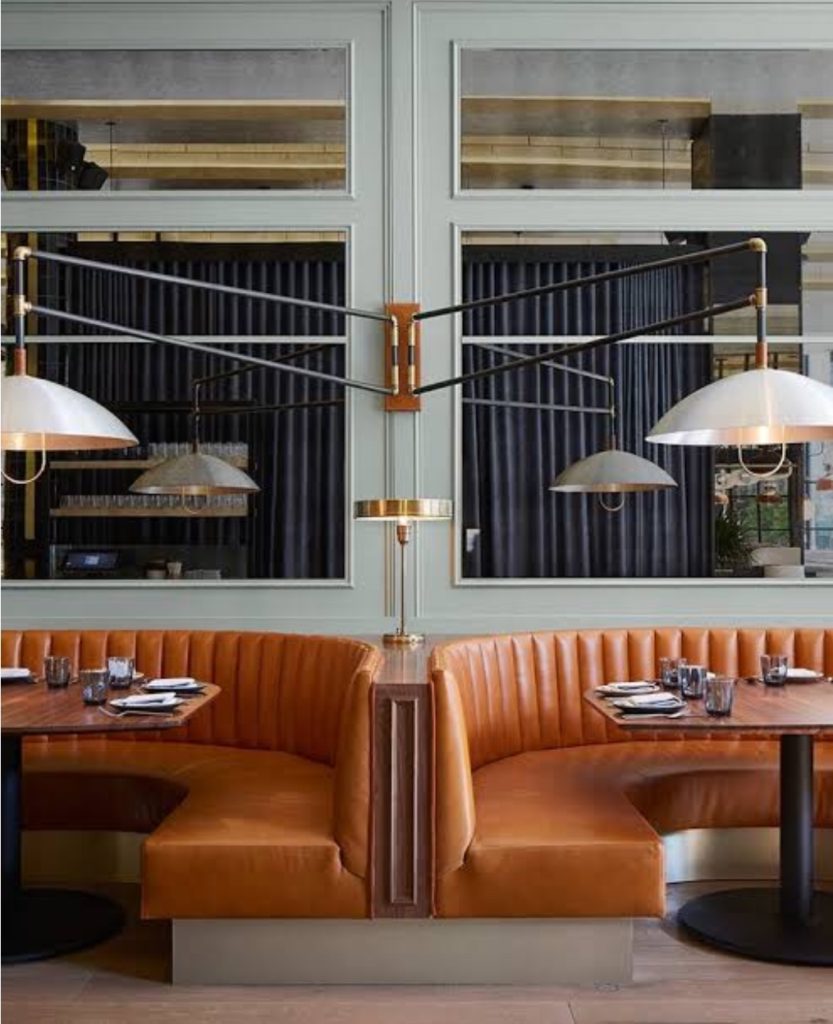
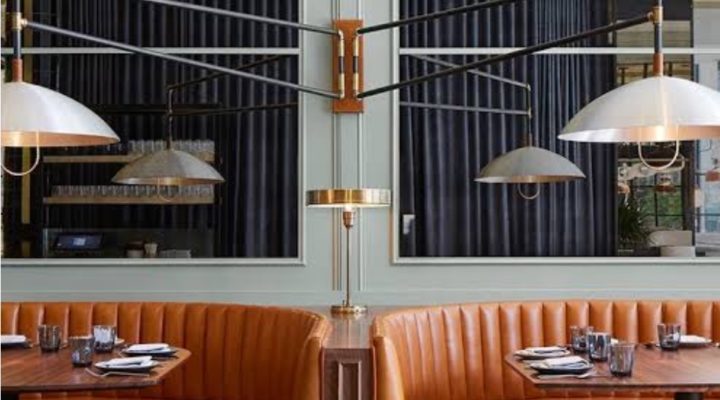
The restaurant Proxi in Chicago is as energetic, fun and tasty as it is beautiful.  The beautiful interior was designed by Meyer Davis, with barrel-vaulted ceiling, colorful patterned floor tiles, floor to ceiling windows, antique mirrors and leather-quilted curvy banquettes.  The restaurant is located in a former printing press and it’s devided into three spaces in a lofty-like space.

Proxi Chicago

Read More…

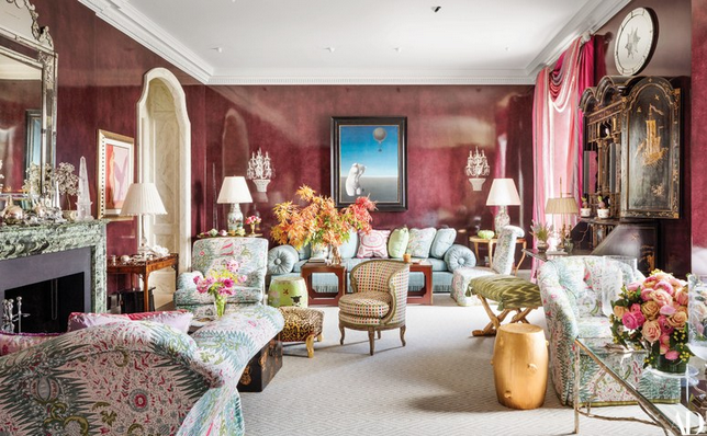
The late Interior Design legend Mario Buatta passed away a few months away.  Buatta was known as the Prince of Chintz for his quintessential use of classic elements such as the traditional print and his maximalist body of work.  In his last project, a glamorous duplex located in Manhattan overlooking the East River, the legendary designer left his tasteful mark in every one of the design choices, comfortable, plump seating, sumptuous drapery with dressmaker details, a glorious selection of color, touches of chinoiserie fantasy, and, yes, occasional bursts of flowered chintz.

Mario Buatta, purple room

Read More…

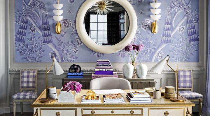
Mary McDonald design, chinoiserie purple and white office

Mary McDonald’s style is synonymous to glamour, grandeur, over the top, and architectural design.  The 17,000-square-foot home she recently designed, distilled every one of those attributes mentioned above, from a very bold home library with custom wall paint to an impressive marble clad entryway.  The home, located in Corona del Mar, California belongs to Jerrod Blandino and Jeremy Johnson couple behind the California-based cosmetics brand Too Faced.

If you ever watched the Bravo TV show Million Dollar Decorators, you may remember Mary McDonald’s exuberant design as she was one of the Interior Designers in the show.  One of McDonald ’s consistent design elements is symmetry which she implements even in the least conventional forms, for instance in every one of Mary McDonald’s office desks; you’ll find a pair of table lamps, never one.  Another design element that Mary often favors is the use of a three-color pallete, a yellow, grey and black bedroom, a pink, black and beige room and so forth.
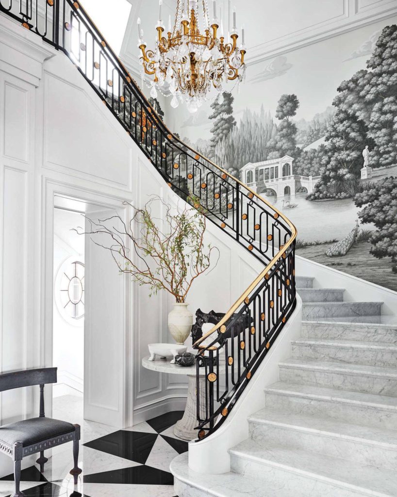
Mary McDonald design, black and white entryway

A custom de Gournay wallpaper with a pastoral landscape.

Read More…
Darryl Carter is an Interior Designer who knows how to juxtapose classic furniture with modern details like a professional. His interiors are always restrained but beautiful, spare but welcoming. He keeps his color palette in the neutrals while incorporating modern art and details that make his interiors exciting and up to date.
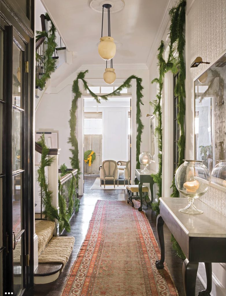
Darryl Carter, Christmas

For the Christmas decor in his townhouse in Washington, DC Carter enlisted the Gardener Sidra Forman.  Forman kept things understatedly elegant by decorating the doorways and stair rails with simple green garland.  Sidra skipped the Christmas light and instead embellished the three and the many wreaths throughout the house with yellow burlap ribbons.  Love the modern way the ribbons were wrapped around the garlands.

Read More…

Stephen Sills interiors seem to emanate a glow from within that grant the spaces an understated glamour.  His Interiors evoke ease for everyday living.  They look updated without being too trendy while classic without rendering in cliché or boredom.  This beautiful apartment on Fifth Avenue was gutted to the core and then redone completely by Architect John B. Murray.  One of the main intentions was not to interrupt the fantastic view of Central Park and to display the extended owners’ art collection.  You can see the rest of this beautiful apartment at AD.

5th av. apartment, Stephen Sills, library

Read More…

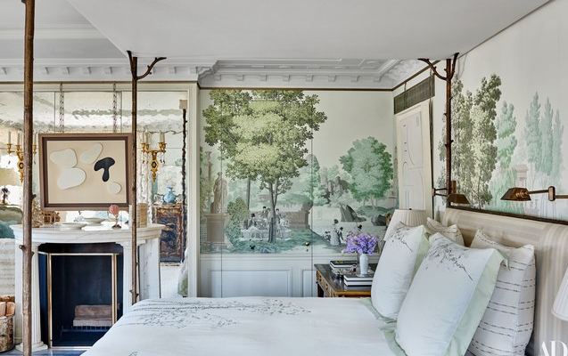
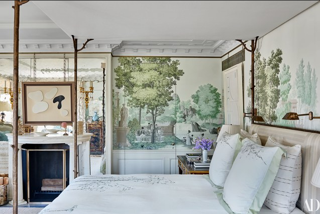
Michael S Smith design Zuber wallpaper
glamorous bedroom, Michael S Smith design Zuber wallpaper

The canopy bed is custom-made by Carole Gratale.

This glamorous bedroom designed by Michael S. Smith, one of my favorite designers, is a product of a long-term relationship between clients and Interior Designer.  Smith has designed more than 12 residences for the homeowners in the span of 25 years.  After a five year long renovation, which involved joining two previously separate apartments, the result is a beauty in every form with a mixture of refined old world and modernity.  The interior design in the bedroom, as well as in the rest of the house is out of the box and without matchy-matchy.  “ There are many high points, but not everything is at full volume.  Overall, the apartment is serene and quiet, not jumpy.” Michael S. Smith.  You can see the rest of this spectacular home at Architectural Digest.

Read More…