Tag: Interior Designer

Mallorca villa

Mallorca Villa

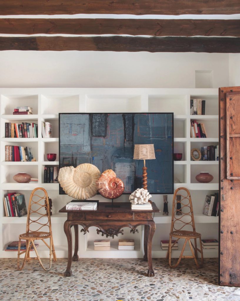
Ammonite fossils on top of an antique table welcome visitors in the entry way.

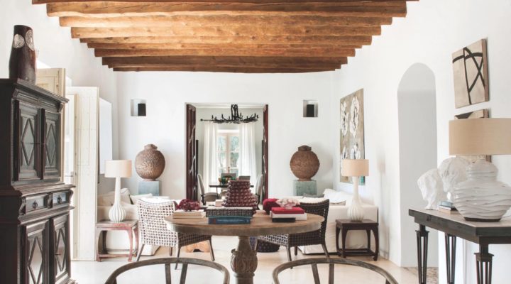
Imagine coming to your summer home and being greeted by an aromatic scent emanating from a line of olive, almond and cork trees that indicate the path to the house. This forever-summer home is located in Manacor in the south-east of Mallorca. It’s been entirely renovated in a way that preserves the house’s original Mallorcan spirit by Architect and Interior Designer Ramon Garcia Jurado. The clients’ request was for a ‘home where you can hang out all day in a sarong and be barefoot most of the time’. The final result is that and more, Garcia Jurado was able to interpret his clients’ wish while making the home also comfortable and sophisticated enough. The white walls and bare resin floors serve as the perfect background for the rich colored antiques throughout the house.

Read More…

sonoma valley, design, Ken fulk

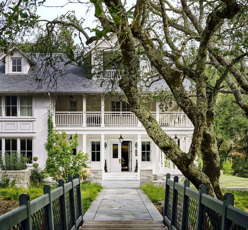
The magnificent house that Ken Fulk designed in Sonoma Valley can quickly pass by a private club due to its enormous size of 600-acres.  The superb property comes complete with a farm, vineyards and natural lake.  The popular Interior Designer wanted to recreate a hyper-realistic feeling as something reminiscent of a Wes Anderson movie.  The property is a four-story lake house inspired by Northern California Victorian resorts with its own lobby.  “A door on the side of the house leads into a bright-blue reception room that acts as a lobby. There is a check-in desk with a bell, and behind it, little boxes that hold the keys to each of the nine-bedroom suites. ”  ED. See what I mean here…

Read More…

Townhouse, interior design, contrast

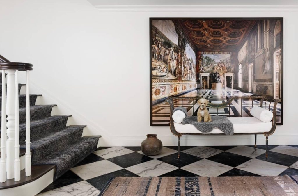
Classic elements are combined in an unconventional way in the entryway of this Upper East side apartment.  The carpet on the staircase is a hand-patched antique runner.

When I saw this house a couple of months ago in Veranda, I knew I was going to post it one day.  Its full of contrast, glam, creativity, and elegance.  The latter is done in a very subdued manner, not over the top but with an evident refinement.  The house was fully renovated by architect Nate McBride in collaboration with Interior Designer Alecia Stevens.  Among the significant structural changes is the fantastic row of steel casement-windows which open onto a terrace on each floor of the house overlooking the beautiful garden in the backyard.  The townhouse shows a great balance between classic, modern and glamour.

Read More…

Tom Scheerer has designed many a beach home in the Bahamas.  In fact, Tom says he prefers them because homeowners tend to be more open to trying new things in a vacation home.  It makes perfect sense although a house like this one, I wouldn’t mind to call it a permanent residence.  Waking up to sunny days and walking on talc-pink-powder-like beaches would be anyone’s ultimate dream.  I was happy to find one of his latest Bahama style projects in the current issue of House Beautiful.

The architecture of this Bahama home is a traditional Colonial home which Scherrer designed for modern life.  The color palette is composed of different shades of blues, sprinkles of purple and rattan furniture.  The kitchen especially is quintessentially Scheerer’s style with graphic cement tiles as the backsplash and no upper cabinets as to avert any form of formality.  A beach house should be free-spirited and airy with durable fabrics and materials.

I especially love whitewashed wood in a beach home, in this case, Tom used a wood called pickled pecky cypress in various spaces in the house to bring cohesiveness to the open rooms.  All the fabrics in the house are indoor/outdoor… practicality is everything.
beach home, bahama style, rattan, blue, living room

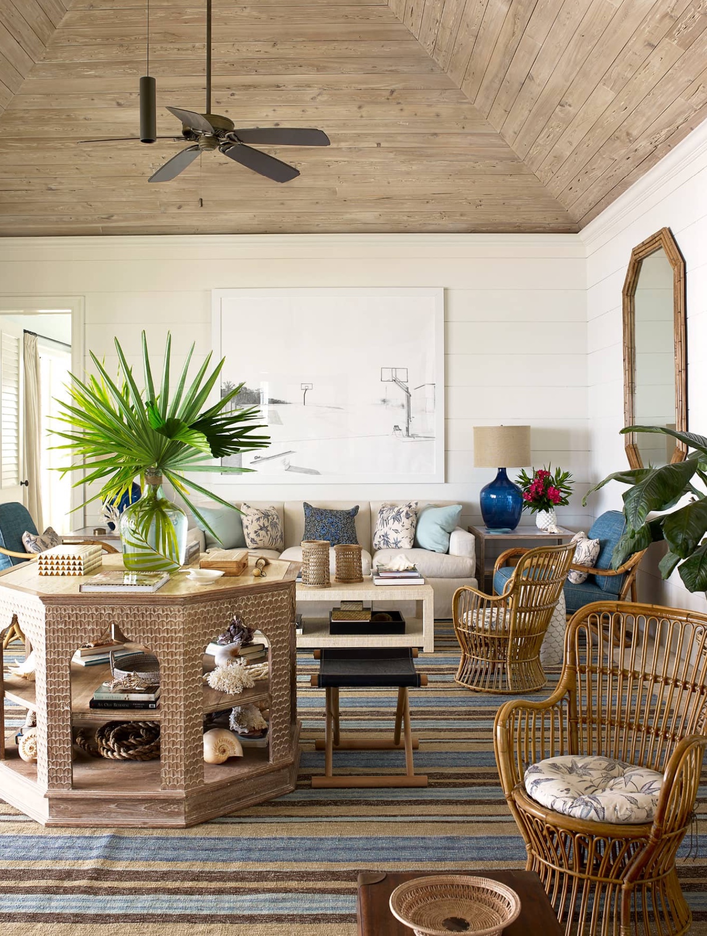
The living room has white shiplap on walls and the tray ceiling is clad in beautiful pickled pecky cypress.  Notice how the striped rug picks up the different shades of blue, brown and beige in the room…

Read More…

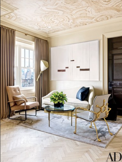
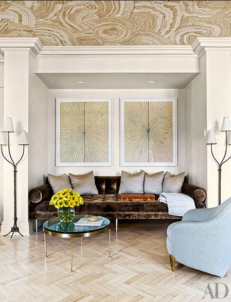
This penthouse in Greenwich Village, New York has all the details of a jewel box with the exception of the jewel tones. Well perhaps you can see one or two. The inspiration for this glamorous and elegant apartment was two chairs but specifically two beige chairs that Interior Designer and Architect Rafael de Cardenas found in Basel, Switzerland. The owner is a London born who moved to New York and whose taste is obviously urban and sophisticated. Although the apartment had been redone previously and was in good shape, Cardenas and its owner decided to make it even better and more appealing to its owner’s taste. Walls were moved and every surface was refinished. The color scheme throughout the apartment is mainly composed of neutrals with lots of pretty details and different metal finishes. Metals such as brass, bronze and steel work as jewelry accessories against the blond-wood herringbone floors and the travertine fireplace. The fireplace has a glamorous brass mantel… or is that painted to look like brass. Either way it creates an alluring effect.
Rafael de Cardenas Interior Designer via belle vivir interior design blog

A Mattia Bonetti chair on the right.  The sofa is designed by Rafael de Cardenas

Interior Designer Rafael de Cardenas living room via belle vivir blog

Brown and blue is a combination that I have always favored.  The day bed is custom-designed by Rafael de Cardenas, the lamps are by Jean Royere.

Read More…

When designing a home around contemporary art, especially if the art is an impressive one, the house should rise to the occasion in more ways than one.  In this case the owner of this Victorian house in London owned a dramatic collection of contemporary art so instead of creating a home that recedes to the background, Architect and designer Shalini Misra created a home with drama just enough to not shy away from the art and with character enough to serve as blending element.  The result is a balanced combination of drama and glamour.

designing a home around contemporary art by Shalini Misra via belle vivir blog

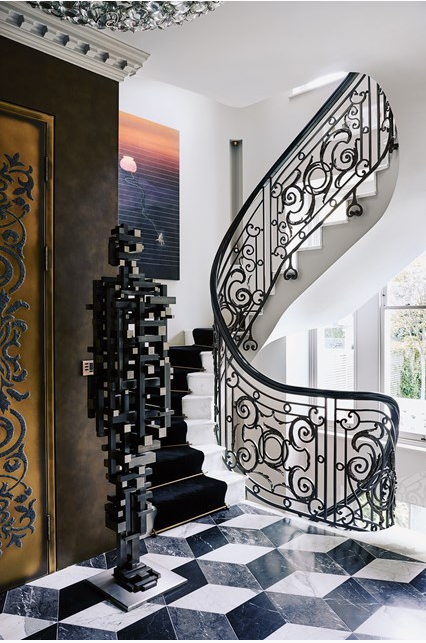
A mixture of black and white play a protagonist role in the Interior Architecture.  The contrasting colors are beautifully used.  We can see them on ornate stair railing and on the Rhombus pattern tiles on the raised ground floor.  The transformation of the Interior Architecture was pretty impressive and left only to professionals.  Since the house needed to be enlarged to accommodate the owner’s art collection, doorways were widened to facilitate the view of the art.   The basement was dug deep to create an extra 418 square meters for a swimming pool, gym and spare rooms.  As well as the staircase was relocated to move clockwise between all floors.  This last move was inspired by Vastu Shatra principles- a traditional Hindu system of architecture meant to bring harmony into the home.

designing a home around contemporary art via belle vivir blog

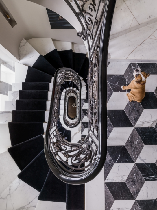
How amazing is this impressive view of the staircase.  Beautiful white marble, velvety stair runner and ornate railing combined with an edgy but still traditional rhombus floor.  It’s a somewhat over the top interior design.  Though a kind you can live with thanks to the classic references and neutral tones.  I say, I’ll take it.

Read More…