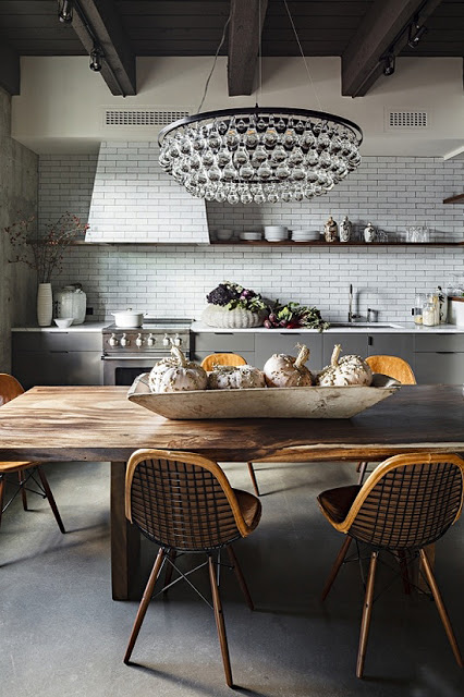
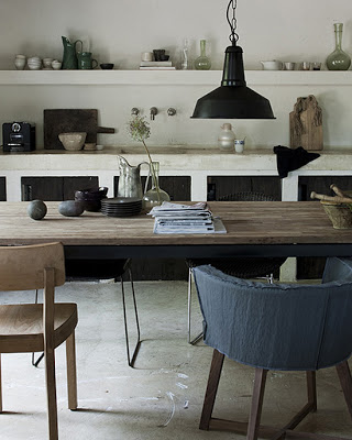
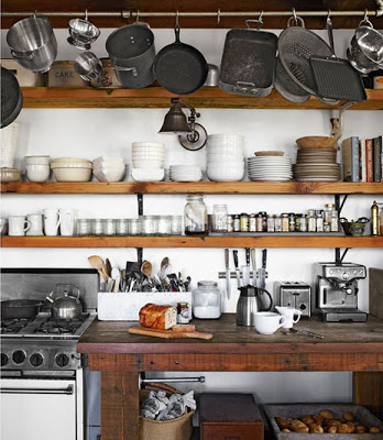
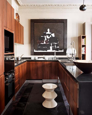
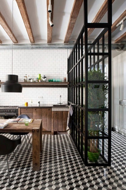
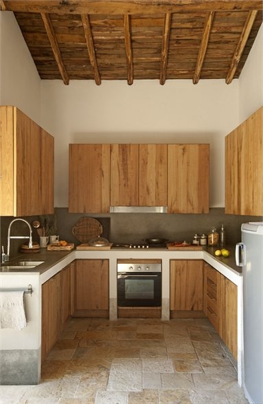
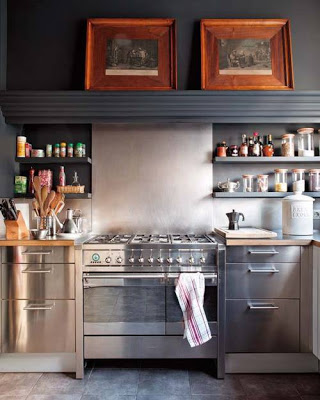
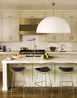
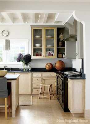
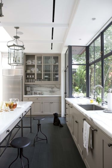
A masculine aesthetic is perhaps one that appeals to a much broader audience
than a more feminine one especially if it’s combined with industrial
touches. As a matter of fact many women, me included, prefer to keep away
from the very feminine design, particularly from those with overdoses of fru-fru;
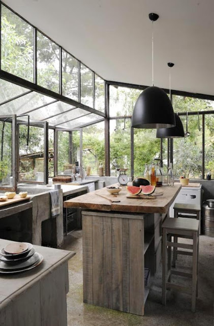
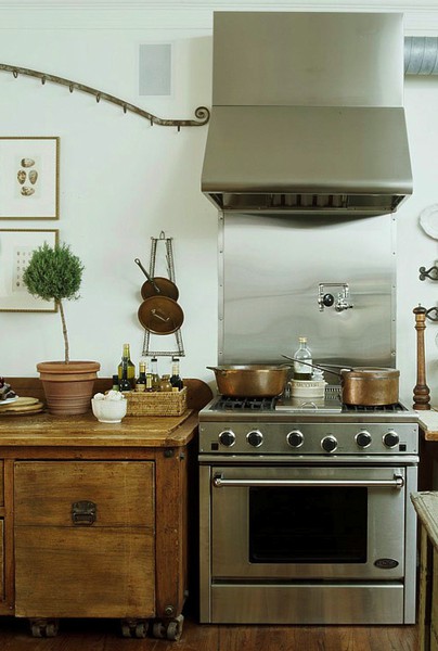
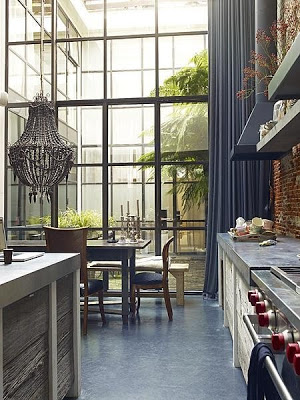
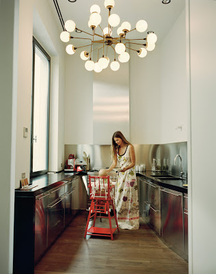
aka. looking like a doll house. Luckily there is the Unisex Kitchen style with prefer light and clear spaces. Chunky wood, metal,
concrete, stainless steel, oxidized finishing on either wood or metal are only
a few of the many options to keep in mind when going for a unisex neutral
kitchen. Enjoy!
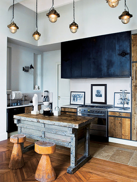
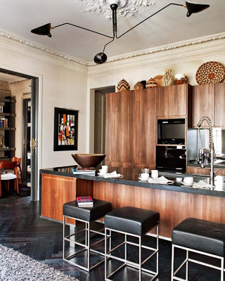
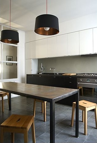
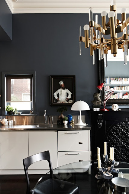
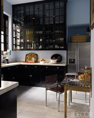
Of all the black kitchens I’m posting today the first one below, is probably my favorite. It has a sort of personality that makes it very unique and real. If not for those reasons, then for the up to ceiling black upper cabinets with all-good benefits. I also love the touches of global-chic accessories on the counter top. The thought of a black kitchen would give anyone a disbelieving smirk face along with a swiveling shaking head but as you see, it is very elegant. Most people are much more used to seeing bright white kitchens than anything else and the first thought that comes to their minds when considering black cabinets for their kitchens is a dark dysfunctional kitchen. It’s all in the natural incoming light, use of material and contrast. Keeping most of the kitchen surface -walls, counter tops, ceilings and floors- in light colors would make for the right balance and contrast in the room. The finish on those outer layers also make a big difference; mirror and glass when used as doors, back splash or even walls bring in a lot of light into the space. Of course last but not least, there is also the option of installing artificial lighting that can go any where. Enjoy!
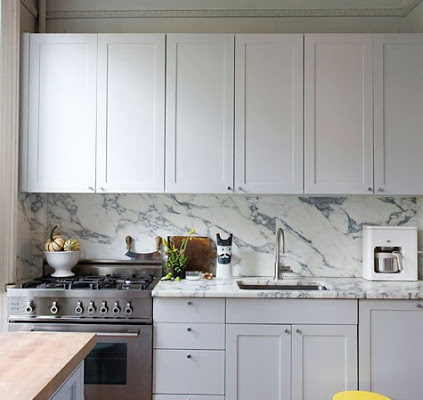
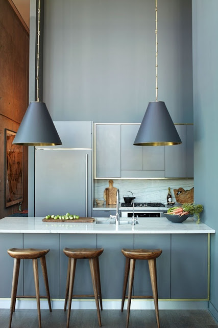
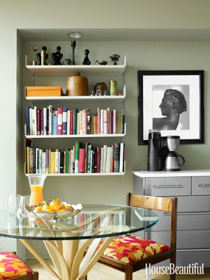
Although I’m more inclined to a mixture of modern and traditional. My Interior Design style consists more of classic lines combined with modern touches; I appreciate modern and clean lines in Interior Design. Especially because it’s a smart way to go when dealing with tiny and narrow spaces as in these small kitchens. As it’s well known “less is more” and I’m not one that uses that term very often because mathematically doesn’t make much sense, lol. On the other hand, though these small modern design kitchens featured here are all small and with clean line kitchen cabinets, they all have something in common that stop them from being boring. These unique elements are the finishing on the cabinets, fixtures, and accessories. These smart designers kept things interesting with finishing such as lacquer, stainless steel, gorgeous marble as backsplash, and a lot of brass or gold accents. Lovely details that can make all the difference. Who said that modern kitchen design has to be boring?
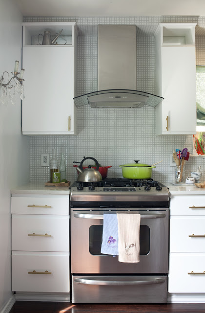
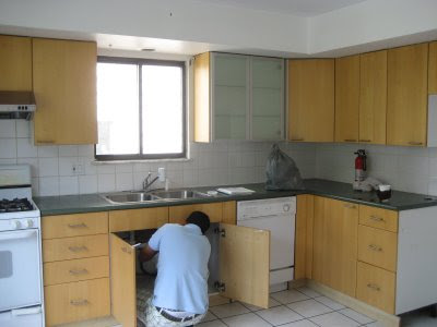
While thinking about what to post today, my kitchen renovation before and after came to my mind. Since we’re soon moving to another country (Sao Paulo) I feel it would be great to show how I renovated our kitchen. The second picture below shows how our kitchen was before. Very unattractive! We teared down everything, from the cabinets to the walls, got rid of that double tray ceiling and redid the floor. My vision was to create something charming instead of modern because this house was built around the 80’s when there was absolutely no reference whatsoever to any period architecture. So I decided it would look like something between old and au courant. I hope you enjoy my kitchen before and after Julie Paulino Design.
I love the subtle shimmery of the mosaic. I added mirror on the back of the upper cabinets to create light reflection.