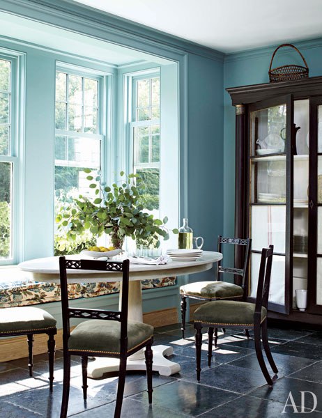
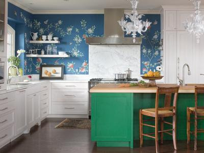
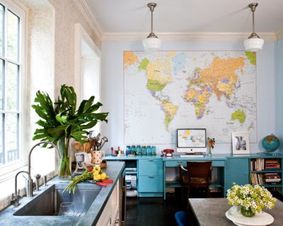
This kitchen designed by Miles Redd for a family in Connecticut is in the July issue of Architectural Digest. I love how the blue of the walls and wood color of the cabinets contrast each other. Miles really knows how to make an impact. Enjoy!
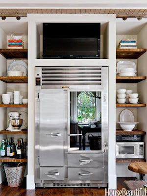
Having a TV in the kitchen is a common practice in the American family. It can be either beneficial or not beneficial, depending on how is used. Many people have a TV aversion. Sort of like the TV will slowly morph into their brains, brain wash them, and wake up the next day as an even worse person. I can understand the sentiment, however as everything else in life moderation is the is the key. A TV in the kitchen can be helpful for the mornings when everyone is multitasking while getting ready to rush out the door. Let’s not forget that balance is a very important discipline in life. I currently don’t have a TV in our kitchen but, I’m guilty of turning on the one in our living room and keeping it on while making in the kitchen, hello CNN in the background. It keeps me company while well informed! However in the mornings when we find time to sit down and have a decent breakfast, the TV will be off for quality family time. Another benefit is the feeling of familiarity a TV provides to any room. Below, 7 Stylish Ways To Incorporate A TV In Your Kitchen.
Keep it highly above the Fridge. By keeping it high enough and not a at eye level, it becomes more of a sound device and will keep you from visual distraction.
Keep it next to your morning coffee station. Having a small TV next to where you prepare your coffee every morning is deal to catch up with the news briefly.
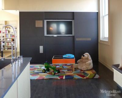
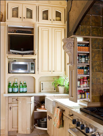
Customize a space for it and treat the TV as if it were an appliance. By camouflaging the TV into a custom wood wall it practically disappears.
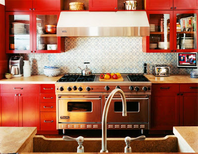
Hang it from the upper cabinets. Now this way takes it to the next lever because it doesn’t occupy any space of your counter. I love the red in this kitchen where the TV is attached to the upper cabinets.

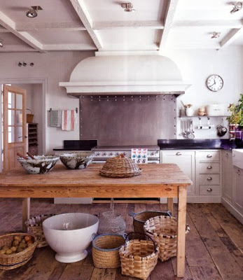
This kitchen I came across with is from a newly constructed farm house in Spain that Isabel Lopez Quesada created together with architect Pablo Carvajal. It’s hard to guess that this kitchen with that old and graciously run down feel is newly constructed. There are many obvious elements that help create the ambiance of old, from the reclaimed wood-plank floor, the classic bin cabinet pulls to the curved over sized range hood. I love the details of the rivets on the stainless steel backsplash. The range is Lacanche. Enjoy
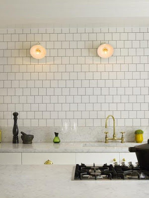
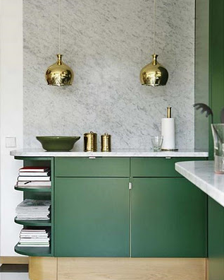
Ever since kitchens became the center of the house, meaning that they
are usually literally in the middle of the house. More often in homes
or apartments with an open floor plan, they are looking less and
less like a kitchen. Leaving upper walls empty of cabinets that could
make the space feel cramped or closed in and instead making them a focal
point by using beautiful stones or tiles, adding sconces, art and many
other things that before were more commonly used in other rooms of the
house. I like this new recent trend, I like the idea of making the
kitchen part of the decor of the house, if living in a place where the
kitchen is open. Enjoy!
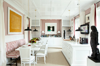
Before this kitchen it was hard to imagine a home kitchen that would look like a cozy country club restaurant. Love love love the way the open leggy banquette makes everything look more open. A fantastic way to lighten up the closed cabinets. If it weren’t for the two fridges in the back I would not think this was a kitchen, perhaps a bar area… or part of a family room? I don’t know… I’ll take whatever was left over from it!

