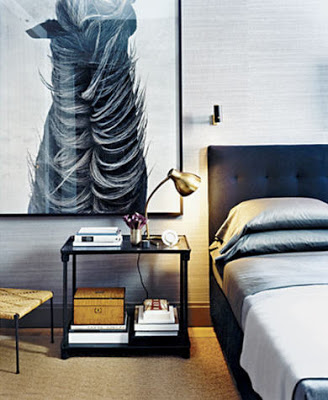
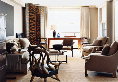
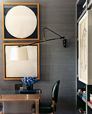
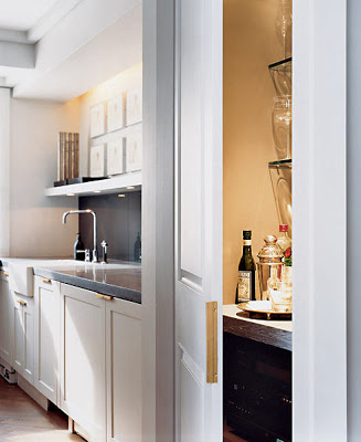
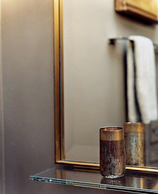
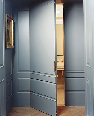
I’m pretty sure many of you have already seen one or two of these images here and there. The more than spectacular apartment of Francisco Costa, Calving Klein Creative Director, and partner John De Stefano was featured in the NY times magazine way back. The couple used a “gentlemanly restraint” approach somehow a mixture of masculine and minimalist with some unique pieces. The apartment is painted in different shades of gray throughout, including doors making them seemless. The bedroom is covered in seagrass wallpaper with accents of black, brass, and browns, which gives the room an aura of subtle glamour.
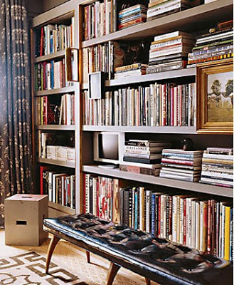
It’s very interesting to see how the over-scale horse photograph, being so powerful as it is, does not overpower the vibe. I love that room. The bookshelves (below) have been a favorite of the blogsphere ever since and no wonder why, the muted colors here, again blending greatly. Notice the Greek key border on the carpet.
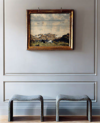
The benches are made of concrete. Besides the detail of different shades of gray and the concrete benches, I don’t really find this apartment to be minimalist, but hey if it is, then I’m a converted one.
Pictures by Martyn Thompson


Vyna St Phard
Love the subtleties of grays. Its effect can be overdone, and the results are usually "smoky" which in itself, is not necessarily a bad thing.
Casa Très Chic
Hi, Julie!
Francisco Costas's apartment is fabulous, I posted about equestrian style and their bedroom is one of the images.
Have a happy weekend.
Big hugs from Brasil
Tereza
Anonymous
Any idea who the photographer is that does those horse pictures?