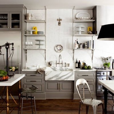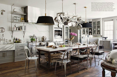
Ever since I saw this kitchen at the current issue of Veranda Magazine I was taken by it. Windsor Smith, the designer, incorporated industrial elements in a classic background to create an open, grand and unique kitchen. The first thing that caught my eye was the balance scale on the picture above. Isn’t that an exquisite detail? For crying out loud Windsor, God Bless you! Then of course my eyes started to get bigger as I was trying to get everything in. Let’s talk about those gray cabinets, how seamlessly they blend with the carrara marble that is used abundantly throughout. Oh! and that sconce in the middle of the open nickle shelves, oh my! Talking about layers, texture and interest, the wall behind the shelves is enveloped in hexagon marble tiles, really?! Now moving on to the floors, I can see kids coming in and out riding scooters and roller blades and the floors would only get better. This kitchen is an absolute antidote to boring. If it were a brownie I would have already ate it!
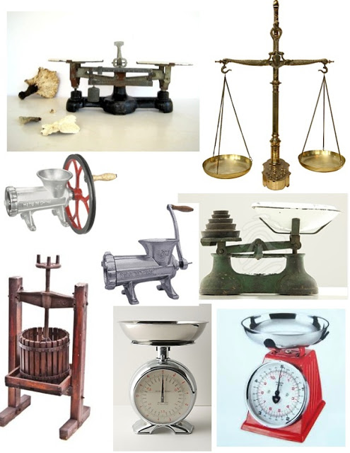
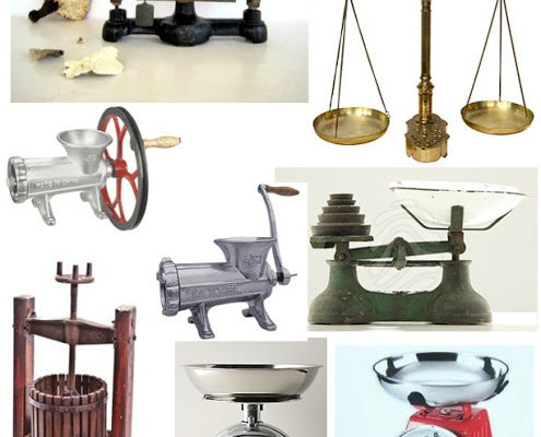
I suspect that we are going to start seeing touches like the balance scale more often and more frequent. Below are a few traditional kitchen utensils and industrial accessories that I think would look great in any kitchen. Many of them can be found at restaurant suppliers.
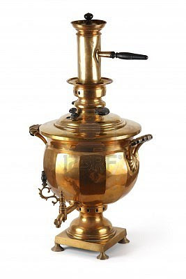
Clockwise, from left top corner, Antique apothecary balance scale at Etsy, Brass balance scale with weights at 1stdibs, old scale, white at Anthropologie, 19th century American wine maker at Urban Remains Chicago, and meat grinders. Below, a Russian antique samovar.

