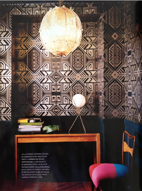
I found this entryway in a Spanish home magazine and fell in
love with the old-school-royal-Bohemian-kind of feel it evokes. I
remembered having seen the geometric wallpaper by Osborne and Little used by an
European Designer way back so I know it’s not a new design even though it
hasn’t been too much used. Unfortunately the magazine doesn’t list the
name of the model and I couldn’t find it out myself either. The console
is by Gio Pointi and the light fixture by Barovier and Toso. I love the
pop of color on the chair fabric. Enjoy!
Image scanned by me.


sharon smith
I agree! It's the first stop in the home. I'm working on mine right now. I don't think it will be as magnificent as what you've shown!
Sharon
Classiq
Yes, every home should have a stunning entryway. Why is it so easily overlooked?
Mary Ann at classic•casual•home
Makes a great first impression.
Fashion-isha
I agree! First impressions matter!
xo
Sharon
Karen Frost
A lovely first impression! I really love the dark blue on the lower half. xx
ChArIsSe
me too I agree that the entryway should be stunning, got an idea with your post to do some renovation in our entryway. thanks for sharing your ideas as always. God bless! cheers! Parol