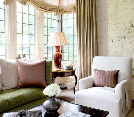
It could be difficult to decide what type of window treatment to use in our homes. When confronted with countless possibilities of window treatments, the feeling could be overwhelming, to say the least. Some windows call for shades, some call for curtain panels, some even for indoor shutters and others beg to let be bare. It would be exceptionally easy if within those previously mentioned categories, weren’t a bunch of other subcategories to choose from. Under shades along, for instance, we have the Roman shade, balloon shades, roller shade, scalloped shade and so on. Under curtain panels, we have different types of pleats to pick and whether or not use a balance or a cornice on top of the curtain. You see where I’m going… I’m amazed at how some people still wonder why there is a reason to hire an Interior Designer… Spoiler alert, because we make things easier.
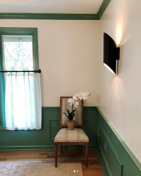
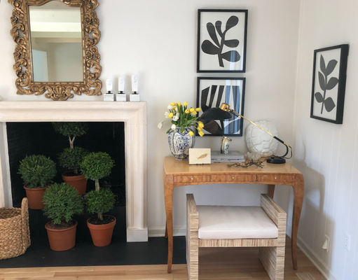
Read More…Nothing will refresh your home more than fresh plants and flowers, however, botanical watercolors come pretty close. Not only do they bring beauty, color, and fun into any room but botanical prints can also bring a sense of calmness and a connection with nature. Whether you prefer an antique version like watercolor or a modern interpretation print, bringing them into your home will for sure add whimsical and energy to your decor. If you haven’t caught up with the trend, there is a real urge for everything nature-inspired lately. We can see botanical-inspired designs on everything from wallpaper, fabric, and art. According to Elle Decor “This year alone, searches for botanical prints are up 114% on Pinterest, while interest in framed plants is up a whopping 396%.”
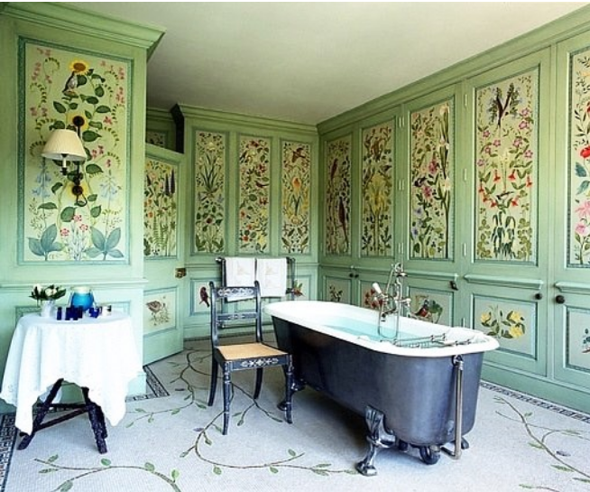
I love the use of botanical prints or drawing on the panels of this bathroom. They dress the whole room while giving it consistency.
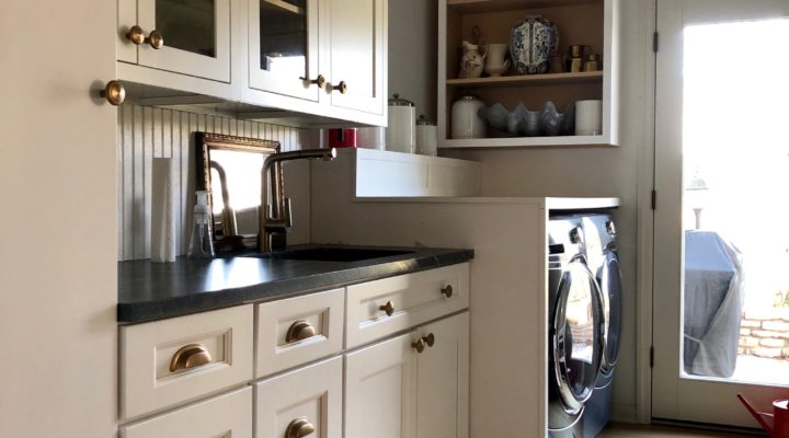
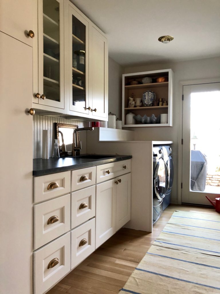
Every homeowner dreams of a big mudroom where family members can walk into. The bigger the family the more the need for a functional and utilitarian mudroom. When we purchased this home, there was a spacious room in the back of the kitchen with no washer and dryer and an empty wall. As an Interior Designer, I immediately figured out how to utilize the room better. I was also able to take some of that room to expand the kitchen. I’m aware that not everyone has the necessary space to create the ideal mudroom but don’t you fret, you can still have a designated area that can function not only as a mudroom but also as a focal point.
From rustic to colorful, these are the 10 best kitchens of 2019. As it is usually the case every year, there were many beautiful and functional kitchens, however, some of them really stood out from the rest. I read somewhere that pewter and gunmetal finishes were predicted to be trends this year, yet we didn’t get to see many of them. As you’ll see in most of these popular kitchens, brass fixtures are still reigning sovereignty.
Best Colorful Kitchen
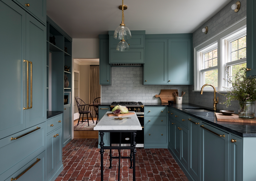
This colorful kitchen is small but it’s full of style and substance, plenty of storage, stone floor, and the right-sized island. The brass hardware and fixtures work as a jewel against the blue cabinets- design by Heidi Caillier.
Best Country Style Kitchen
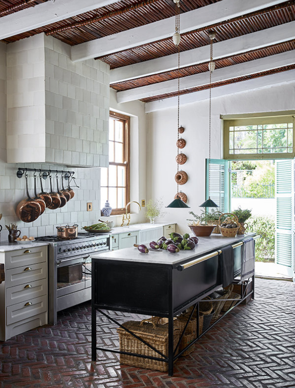
I imagine that if I were to live in the countryside and owned a couple of horses this would be the kitchen I wanted. This country-style kitchen has a great balance between rustic and refinement. The detail of the baskets below the metal island softens up the brick floor. The home of Jacques Erasmus.
I can confess that even when I don’t use much makeup, I’ve been doing the same thing with my makeup application for years, I love to see them displayed on my vanity. Makeup organization can be tricky, mostly because we want them to be functional but we also want them to look beautiful, after all, we are all girls. In this post below, you’ll find many pretty and inspiring ideas for organizing your skincare and makeup.
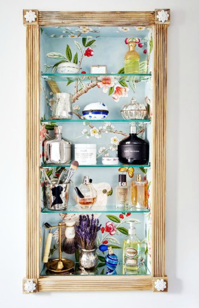
Make It Look Pretty In Wallpapered Niche
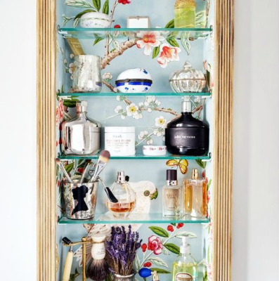
I love what I did with this niche space in our home in New Jersey. I wallpapered the niche, added glass shelves for displaying some of my perfumes, makeup brushes, and a few other toiletry items. This is a more straightforward solution than what it seems, I wrote about it here, and you can see more here.
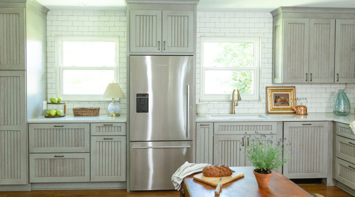
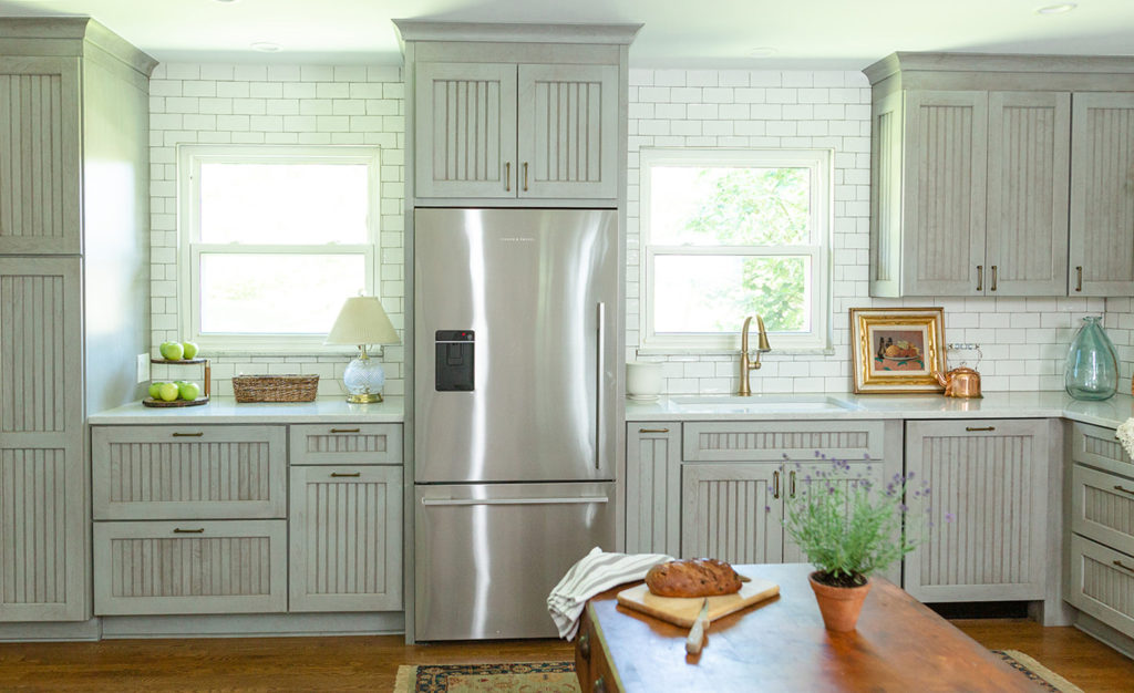
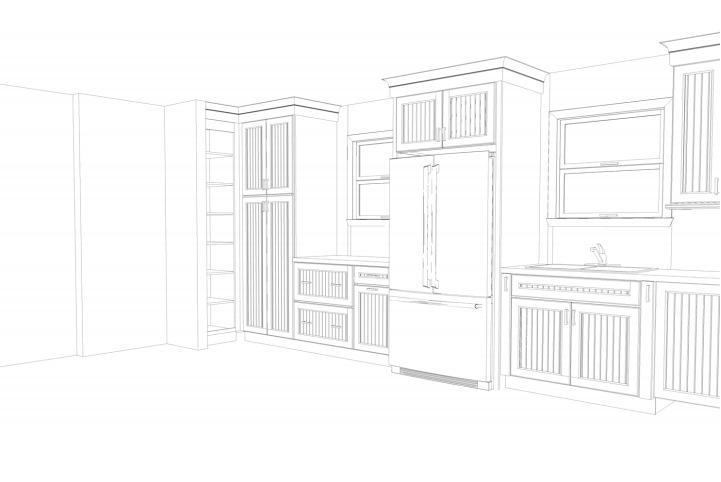
When I asked my client what atmosphere was she looking to feel after this kitchen renovation, her response was, “I want something that feels more like a cottage,” I instantly loved the idea. I loved the fact that she wasn’t looking for a pretentious looking kitchen which would’ve been in complete disharmony with the rest of her home. It all started with a hand sketch of my vision, which she immediately fell in love with. We stayed away from white kitchen cabinets and instead went with semi custom-made grey distressed finish ones. For more of a country feel we chose beaded cabinet doors — Interior Design by Julie Paulino Design.
My client has other homes around the country, and she hardly uses this kitchen, so we were able to ditch some of the upper cabinets. That last option made the kitchen feel grander and brighter. For contrast, we chose hand-made glazed white subway tiles, which also add great texture to the walls. Below, are three computer renderings that we provide our clients once the design is agreed. Further down, a before picture of the old kitchen.