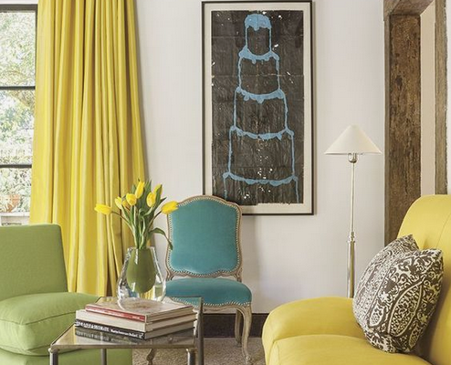
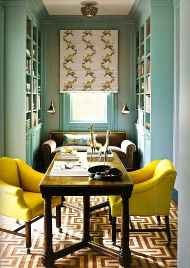
It is said that the color yellow awakens our memory, encourages creativity, promotes communication and fuels our nervous system. All these positive and optimistic reactions are a result of the happiness the color yellow is known to spark. It’s an easy color to combine with other hues, and it adds a spark of light in the process. Although it is a color that enhances the mood, yellow can also provoke different feelings and emotions.
It would be impossible to talk about the color red without mentioning the all-red living room of Diana Vreeland, the renowned columnist for Harper’s Bazaar and later Vogue magazine editor-in-chief. Originally featured in Architectural Digest in 1975, it is still today a source of inspiration, as well as a great example of what bold, daring and unique design, could look like. “All my life I’ve pursued the perfect red,” she said.
A beautiful canopy bed in a bedroom where blue and white are the background.
Don’t mind me saying here in this post. All is taken from Google translate, which is surprisingly good enough when traducing Russia. Gerald Vatle is a TV personality in elgium who started as a chef and subsequently became a Fashion Designer and Interior Designer. This is his home where must of the decor will remind you of the great David Hicks and that’s because he is Gerald’s favorite designer. I love how everything looks like its been there for years, where the walls in common spaces are in bright colors such as dark green and mustard yellow. By the way, not because the public spaces in this house are colorful mean they are suitable for children. Enjoy!
Now that my love for brass, which I’m professing for over two years now, has spread around I’m more certain that real love is the only way to save the world, I mean style. If only the good things were contagious, wouldn’t life be better? Since brass was forgotten and left in absence for a long time, it has staged a comeback for over a year now. It’s been like gold, in the sense that everybody wants a piece of it. And who wouldn’t? The gorgeous metal seems to pretty up everything it touches. Enjoy!
As I’ve said many times in this blog I love colors and one color that’s been buzzing right in my ears, closer than usual, is Cobalt Blue. It could be light or dark but without a doubt the dark tone is more powerful. I would love to paint a library or a TV room in this color and pair it with white. A lot of contrast and impact.