Tag: home decor


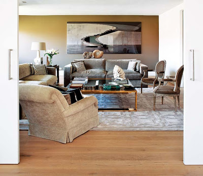
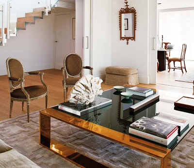
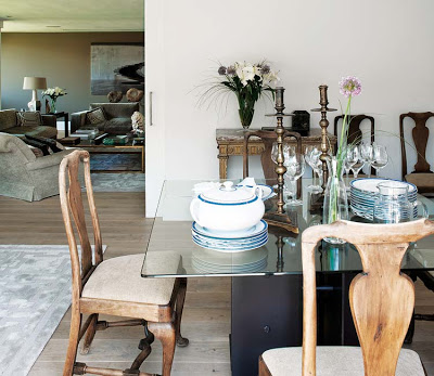
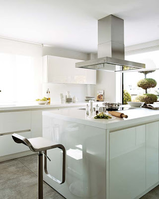
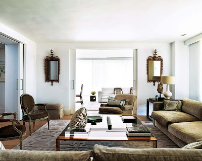
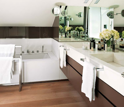
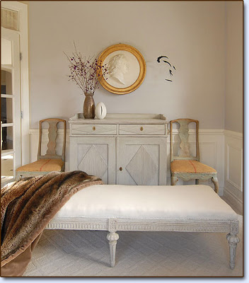
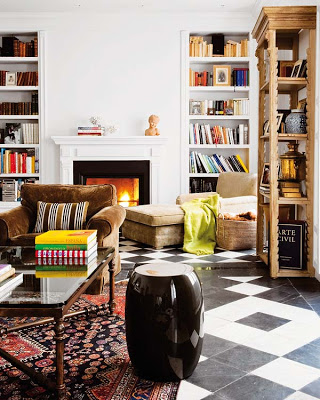
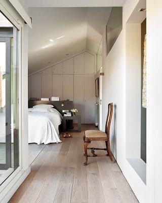
French are graciously eclectic, Italians are modern innovators, but Spaniards are all about clutter-free. Decorator Gema Cidri with the collaboration of Luis Puerta were looking for simple forms to make this home relaxed and elegant at the same time.  Something I’m a fan of if you allow me to tell you.  The layout of this entire flat in Madrid was reassigned to make it suitable to the owner’s lifestyle.  Keeping a monochromatic scheme and all furniture close to one height helps with the serenity of the environment.   Madrilenian design is a bit on the minimal side in a way that they don’t go too much overboard with art.  It seems they rather keep their walls bare more often.  Another aspect very often found in Madrid is the use of sliding, or pocket doors.   I really love that because of their space saving effect.


 This room seems to have no windows but the glasses on the right wall double as an indoor window allowing light from the adjacent room to flow in.

Images via Nuevo Estilo
I’m starting this new series today called “A blogger with Style” where I’m going to profile a blogger and friend who has style in any area of her life.  Frequency of this series, for now, will be irregular but eventually it’ll work its way up to every Friday.  I could not possibly pick another blogger to kick off this series than Monika Claassen from Splendid Willow.  Not only for Monika’s kindness towards others but also because, yes she is “A blogger with Style“.  And in this particular case, in every area of her life. 

Some Interior Designers are in the business by calling or by good taste.  I think in Monika’s case it’s both.  “I remember drawing rooms in the sand with a large stick and decorating them for as long as I could until my older brother and his friends kicked me off the field…” she says.   Her house was recently featured in the last issue of Rue Magazine and it doesn’t take anyone by surprise the laid back elegance atmosphere with a good dose of Swedish influence that accentuates the warmth and coziness.
Monika describes her style as edgy classic with a Swedish twist  and I think she successfully translates that into her interiors.  Monika is not only an Interior Designer, she is also an entrepreneur.  Importing Swedish goods like the beautiful Ilse Jacobsen rain gear to the US market.  You can visit her shop here.  Below are a few images, including never before seen shots of her beautiful home that Monika was kind to share with us.  Thank you Monika for accepting to be part of this new series!


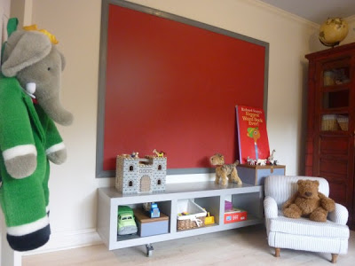
Above is a sneak peak into Monika’s son’s room, which is already showing signs of a little boy’s beautiful and creative room with that edgy Swedish design that characterizes Monika’s style.  I can’t wait to see the final result.


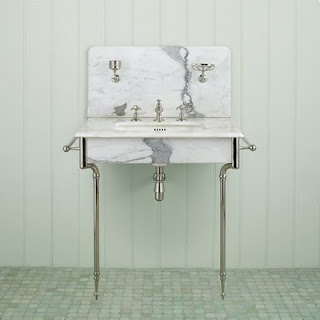
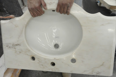
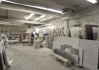
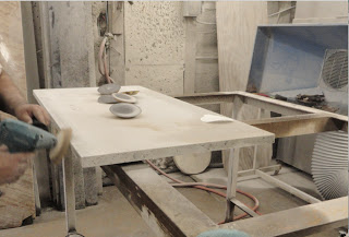
One of my favorite type of marble is Calacatta gold marble, yes because of the golden tones in it.  Remember what I said about buying what you like even when you don’t know when you’ll be using it.  Of course I mean only if it’s a deal!  I found this Calacatta gold sink top, above, at a vintage store.  When I found it, it did not look this nice; the poor thing had seen better days.  The opening of the sink was only 8″ by 6″, it was (dingy and stained) and it was deeper than the size I needed it.  My bathroom is narrow, so this ugly ducky lived alone in the cold in our garage for about a year but he trusted me.  He knew that one day I was going make him look like Cinderella.  So I took him to the marble shop ( I love everything about that place by the way, the smell, the sound, the different stones even the white dust that lies around) So, back to my point, the ugly ducky got lipo-suction in the back and mid-section to fit the space along with a bigger sink and got laser and microdermabration and now he could not be happier!! Anxious to come back home, he’s still in the marble hospital waiting to be picked up by her proud mommy.  But the sink legs (more on that below) need to be extended and attached to it, so the poor thing is not done yet.
hj
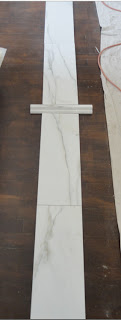
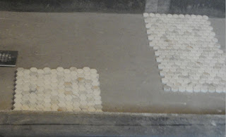
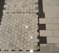
On the floor we installed a heating mat, something I think is very useful due to how cold stones can get.  For tiles I selected calacatta gold marble in hexagon mosaic (below) with a 1 inch diameter and for the walls I opted for bigger slabs with a chair rail.  I decided to install the slabs in a vertical way because of their length at 7″h x 18″w.  If I were to install them vertically it would only help emphasize the narrowness of the room.
 

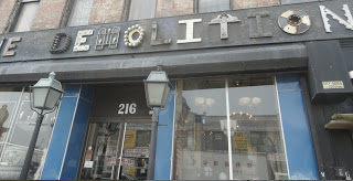
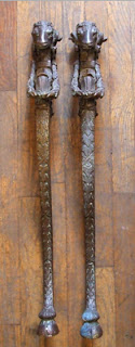
I wanted to use sink legs with more character than the ones normally found in stores so I went to Demolition Depot and I found this rare and elaborate figure bronze legs (below right), a little freaky but very elaborate but for whatever reason they only had one.  I guess there is a one-legged sink somewhere.  Since the heavens had another plan for me,  I walked out of there with a shorter than normal pair of legs (17″ H below left, mine is in nickle) are you serious?  I understand they’re were reproducing something from the 18th ct. but shouldn’t they adapt them to the regular standard size (33″H) of today.  I’m glad I can have them extended!  The legs are very classic French style, below is how they were originally used.  I’m not using them like this though.  I think that style would look great if you’re looking for a more country vibe.
 

Below are the same hexagon marble tiles but in two different directions.  I decided to use the pattern on the right side to be installed on the shower floor and the pattern on the left side to be installed on the main floor to differentiate them a bit.   As you can see they look completely different, the one on the right has some movement in it, like they’re going up the walls and the one on the left is more relaxed and balanced.  As you can see my lovely readers, I went for a classic bathroom.  A bathroom I or anyone can live with for a long time without getting tired or annoyed by it.

images taken by BV for BV.
 

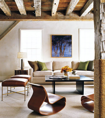
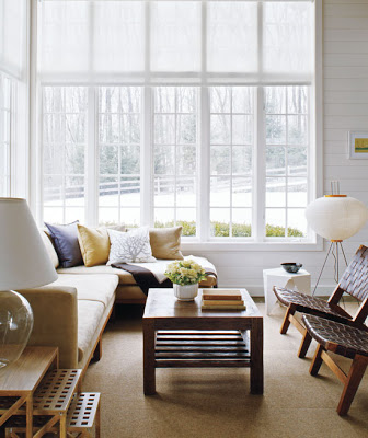
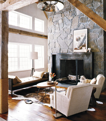
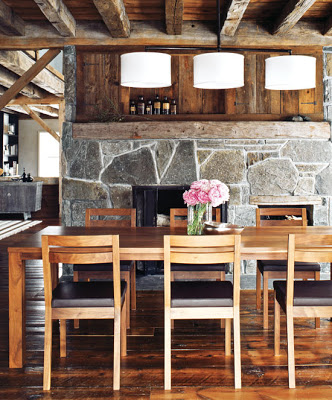
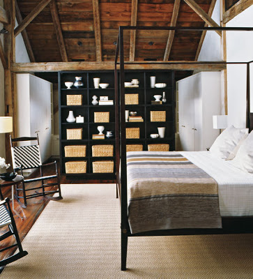
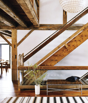
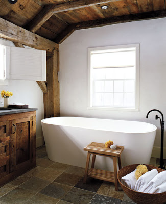
The weekend is around the corner!  With that in mind I wanted to imagine having a weekend home like this in the woods, a place to disconnect from everything and just enjoy leisure time surrounded by family and friends.  It’s good to dream, right?  It keeps you going and also makes you work harder.  Up until I saw this barn that was moved from Canada to Connecticut I had the belief that only certain houses can be moved. Never thought that something in this size and structure was possible.  Not even by pieces.  Russel Groves, the designer and architect responsible for the modern update of this barn, describes himself and firm as modernists.  But in this case, and because of the owners’ lifestyle, he decided to preserve the warmth and charm of the space.  I think he nailed it!In the stunning living room (top image) sculptural chairs, slick ottomans and a over sized sofa with pillows juxtapose exceptionally well due to the muted colors.  Notice the column covered with rope- a very nautical and country touch?
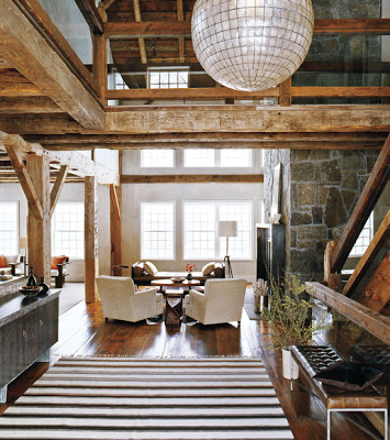
An oversized Capiz-shell globe chandelier welcomes visitors from the double-height ceiling.
Love those windows.  This entire room is very inviting.  Right?
This barn must be huge judging by the different sitting areas. 
The set of flowers on top of that table looks like it’s been naturally bloomed there.


That free standing pedestal tub looks like a cloud in an Autumn ski to me.
The staircase is a sculpture on its own, with glass and a modern bench that offset the massive use of wood.
images from here.
Upholstered doors

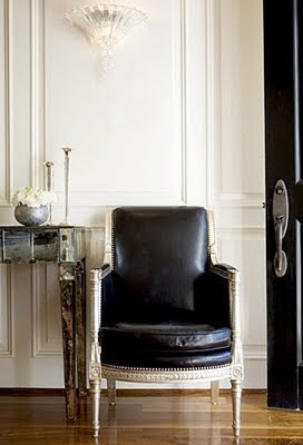
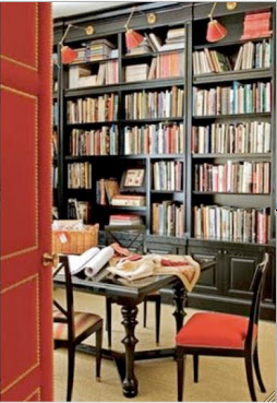
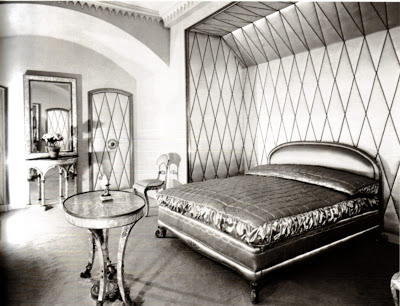
Upholstered doors are perhaps the crown jewel of detailing.  One thing is to add moldings, dado rails and/or to cover a wall with mirrors but upholstering one door is the epitome of attention to details.  Although most commonly used in the glamorous times of the ‘30’s; according to Suzanne Rheinstein, upholstered doors were also used in kitchen doors of the English Estates to keep the sound and the smell of cooking from spreading.  Very clever!  One of the first old images that come to my mind is Helena Rubenstein’s Paris apartment ca. 1937 where sumptuous satin fabric covered the doors in her bedroom.  In the time of glamour and exuberance of the ‘30’s, doors were a lot more elaborate with patterns that not only emulated the shape of the door but were more like plain canvases where different designs patterns were created.  Keep scrolling down to see Miles Redd’s upholstered door featured in New York Social Diary.

Upholstered doors

Helena Rubenstein’s Paris apartment 1937.  Image via Corbis.

Read More…