Tag: home decor

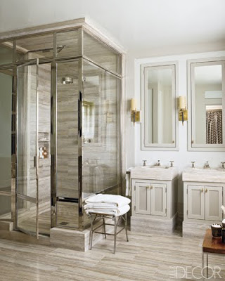
Marble Shower Design steven gambrel via belle vivir
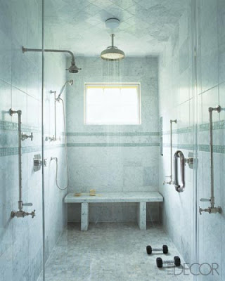
Steven Gambrel via Elle Decor

Remember my dilemma with not having enough space for a deep bathtub in our master bathroom. Well, after I figured out how to make it work (by replacing the adjacent bathroom’s door by a pocket door and taking over 5 inches); I sat down and thought why all the hustle and bustle for a bathtub that is not going to be deeper than 17 inches? Unfortunately bathtubs start getting deeper after 6′. So I decided for a shower instead with a wooden bench to sit on and give myself my own pedicure. That’s what we have right now anyway and it’s worked pretty well. It’ll only be a lot nicer. All these images are more than inspirational and even our bathroom won’t be lined in Onyx or in any of those one-of-a kind marbles that Kelly Wearstler seem to love; I’ll let you know later what I’ll use.  I also love all the glass doors in these showers.  Steven Gambrel (above) via Elle Decor seems to favor travertine marble for the showers he designs.
Kate Spades is my kind of girl because she rather have bigger common spaces like a living room, library and bedroom than bigger baths. I prefer that too. The spacious shower below also found at Elle Decor is like a personal gym also.
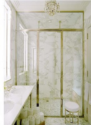
Marble Shower Design via belle vivir


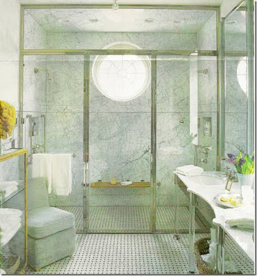
Marble Shower Design  Nathan Egan via belle vivir
In this bathroom designed by Nathan Egan the walls are covered in marble and the floor seem to be covered with penny or hexagon marble tiles.


marble shower design via belle vivir blog

The basketweave floor tiles have no competition because of the use of lucite/acrylic legs as sink base.

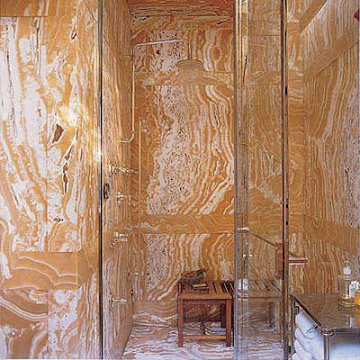
A complete covered shower in onyx.

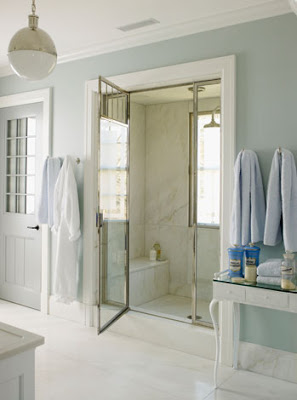
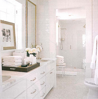
 David Jimenez used white subway tiles on the walls and marble mosaic on the floor in this all white bathroom.

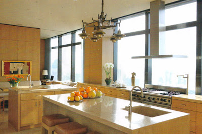
I’m afraid of heights. Any floor above 6 will give me the creeps. But this Kitchen, designed by Carlos Aparicio on the 76th floor of a new building, surprises me to my core by how much I like it. Being in a modern architecture with steel windows that go up to the ceiling, but it’s yet cozy and warm. I’m sure Aparicio was looking to get that effect when he opted for limed-oak wall paneling and cabinetry. The thoughtful touch of textured travertine on the island and counter top don’t fail either. I love that inviting little eating area and the work space in the far back looking out the window. I can imagine this kitchen towards the end of day to be filled with sunset light and me sitting in that eating area sipping a cup of cortadito while looking out the window. But of course I would be sitting in the far left side and only looking straight out front, never down.
Photo by William Abranowicz for Architectural Digest.
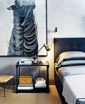
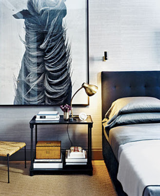
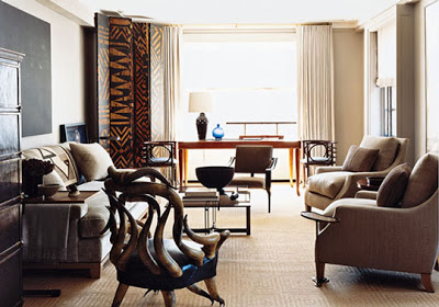
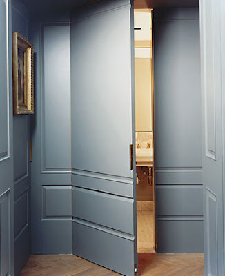
I’m pretty sure many of you have already seen one or two of these images here and there. The more than spectacular apartment of Francisco Costa, Calving Klein Creative Director, and partner John De Stefano was featured in the NY times magazine way back. The couple used a “gentlemanly restraint” approach somehow a mixture of masculine and minimalist with some unique pieces. The apartment is painted in different shades of gray throughout, including doors making them seemless. The bedroom is covered in seagrass wallpaper with accents of black, brass, and browns, which gives the room an aura of subtle glamour.

Francisco Costa home bedroom
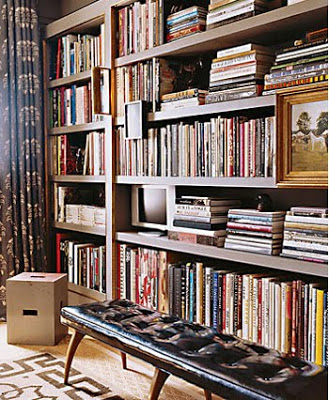
It’s very interesting to see how the over-scale horse photograph, being so powerful as it is, does not overpower the vibe. I love that room. The bookshelves (below) have been a favorite of the blogsphere ever since and no wonder why, the muted colors here, again blending greatly. Notice the Greek key border on the carpet.

 Francisco Costa living room
Francisco Costa bookcase/lybrary with black leather bench infront
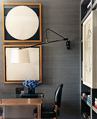
Francisco Costa home desk with swing arm sconce
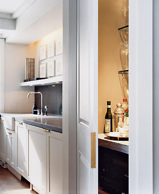
Francisco Costa home kitchen

Francisco Costa home jib doors

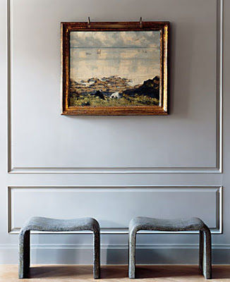
Francisco Costa home concrete benches in hallway

The benches are made of concrete. Besides the detail of different shades of gray and the concrete benches, I don’t really find this apartment to be minimalist, but hey if it is, then I’m a converted one.
Pictures by Martyn Thompson

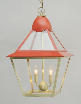
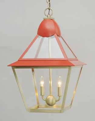
The previous week I met Amanda Nisbet at the Crosby Street Hotel where she was presenting her new line of lighting for Urban Electric. Amanda told me that she wanted to create a collection of lighting which looks like jewelry that would embellish the home. Of course coming from Amanda, known for her bold use of colors in elegant ways, you know you should expect a collection of lighting that is young, fun and colorful.
As most of Urban Electric products, Amanda’s line of lighting is fully customizable in scale and colors. My personal favorite is Poppy (first pictured above) with the magnolia-shape holder. Isn’t that a lovely detail? And, as I’ve said so many times before, brass is one of my favorite things. Montreal in blue (below) is Amanda’s favorite. I think it would look great in a child’s room or in a chic media room. For more info please go here.


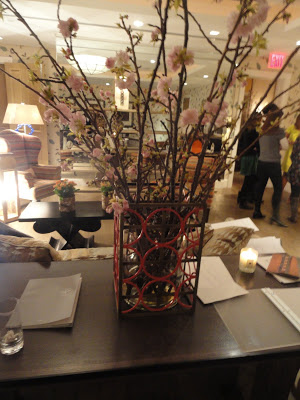
How creative. This is one of Amanda’s lighting used as a flower base.
 

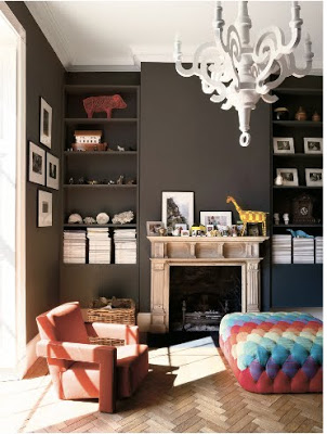
While reading T magazine over the weekend I came across this house and it literally took my breath away. The Georgian mansion called Dinder House sits on 23 acres in Somerset, England. Chris and Jo Mycock bought the house and all their request was to have a house fun and child friendly, a place where their 4 boys can spread around and run. As consequence a modern home designed by Ilse Crawford was the result, complete with lego rooms, a basement dedicated to a more than imaginative playroom and a table tennis room with an oversize colored-glass Venini chandelier hanging above it. Now wait until you see what they did with their kitchen. I’m more fond of traditional kitchens but what Ilse did with it, it’s such a clever and innovative idea in order to not alter the architecture. To read more and see more pictures of this gorgeous house go here.

This uber chic cabinet depicts the story of the house in a custom marquetry job by Studio Job. It doesn’t get more customized while child friendly than this.
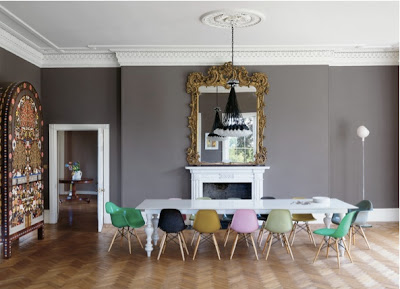
The herringbone floor, the gilded Georgian oversize mirror, the Eames dowel leg chairs in different colors and the Rody Graumans’s 85 chandelier juxtaposed perfectly. I mean, in my opinion this room is perfect.

Love how playful the hand-blocked wallpaper from Paris looks when used together with modern furniture.
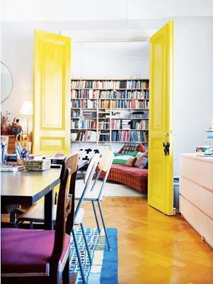
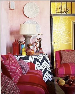
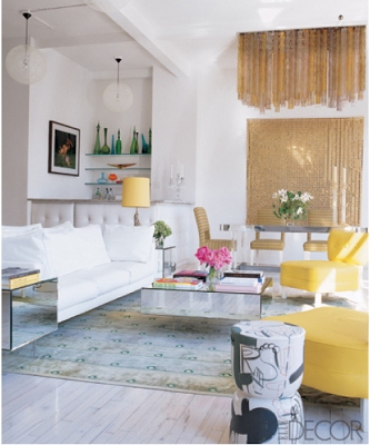
I don’t think I would opt for yellow as a wall color. I think it tends to look too serious or too plain colonial when applied on walls, and it could also be too overpowering. But I’m loving the idea of using it as accent color. Because it’s such a strong color it could make a big impact when used in beats and pieces throughout the house or maybe as a very bold wallpaper in a hallway, like in one of the images below.


images via Casa Sugar, Remodelista, Elle Decor