You may remember Sig Bergamin’s beautiful work when his beach house was featured, not long ago, in Elle Decor. His beach home had a mélange of different textiles and patterns from many places around the world that he boldly mixed with blue and white Chinese ceramics, African artifacts and other curiosities he had collected during his travels. All put together with a very relaxed feel. I’ll be visiting Sao Paulo soon, and I’m seeing a lot of homes that have been featured in different magazine lately that make me curious to see what I’ll find while I’m there. I visited Sig Birgamin’s website and I was smitten. Below why. Enjoy!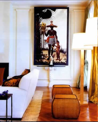
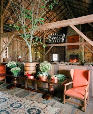
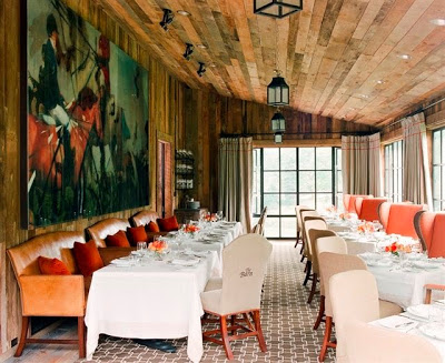
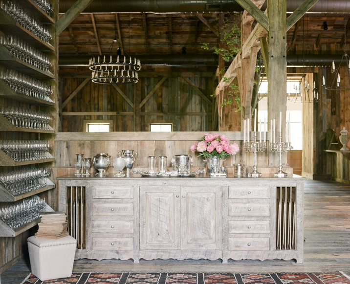
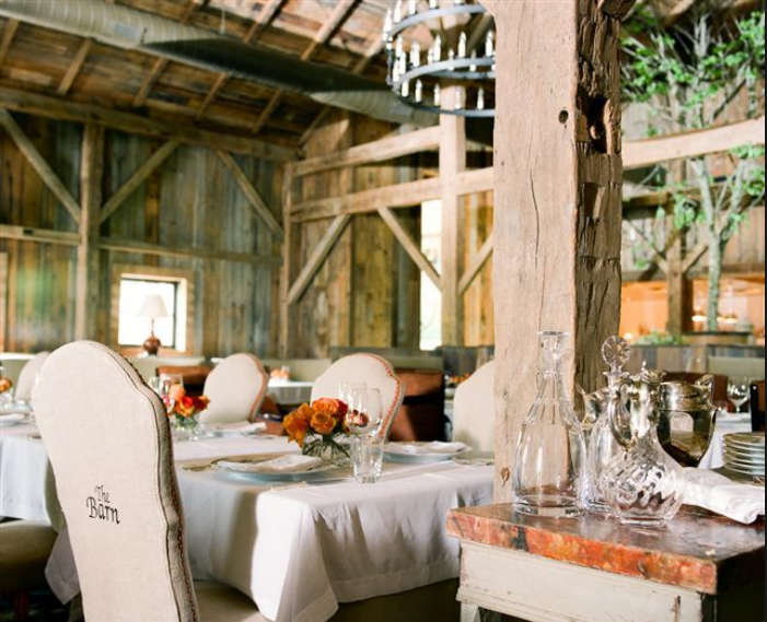
Architecture is one of my primary passions. It’s even embarrassing to say I studied Architecture for a year and a half to then drop out in an action I can only call a young age crisis. That is one big regret of mine. Anyhow, back to my topic today. From my point of view an interior decor not architecturally enhanced is not good. And when I think of places with strong architecture, not only palaces come to mind but also something completely opposite but also impressive. A barn for example, originally made from lumber, gambrel roof to maximize storage, exposed wood and beams to support the ceiling. When visiting Suzanne Kasler’s website the other day I was astonished, one more time, by the incredibly beautiful work she did decorating The Barn, a restaurant located in Blackberry Farm, a resort located in the Mountains of Tennessee. I absolutely love Suzanne Kasler’s design, she seems to always work in houses with breathtaking architecture. Judge by yourself, enjoy.
I adore the color scheme of the space. Tanned leather, beige, browns and subtle pink?
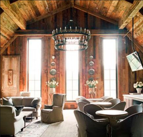
The rusticity of the wood is softened up by the upholstery and slip-covered furniture.
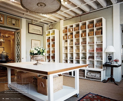
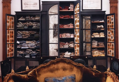
Even the masters don’t stop remodeling and making changes in their homes and offices. This is obviously the case with anyone who loves and/or is involved in Design. When I saw the office of Bunny Williams featured in the current issue of Lonny Magazine I couldn’t help notice how her office has gone through a major transformation from the last time I saw it in her website. This time her office has a more Scandinavian vibe than the more Roman/classic influence of the previous design. New white bookcases make the room lighter, brighter and younger and that yaw dropping Swedish bed corona above that table give another life to the ceiling.
I posted a few times about Tom Scheerer’s spectacular beach style. When I think of a long weekend the first thing that comes to my mind is a comfy beach house where to escape. Since we can’t go anywhere this weekend I can only dream of being in this gorgeous house designed by Tom Scheerer that has enchanted me since the first time I laid my eyes on it. I love how the beauty of this house slowly reveals itself. As I keep looking at it I can notice the different colors and textures that at first are barely discernible due to the calmness in the colors. I also love how the playful patterns on the fabrics and wallpapers and the comfortable furniture make this house perfect for a family vacation home with a great degree of sophistication. As this house proves, a beach house doesn’t have to lack grandeur.
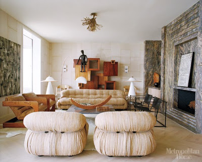
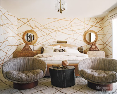
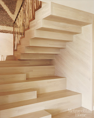
Kelly Wearstler did it again. This time in a unconventional beach house she designed for her family. All furniture and decorative pieces are sculpture on their own. Many of the furniture and sculptures use in Kelly Wearstler’s Malibu beach home were custom designed by Wearstler. I know this is not a house that it would be appealing to many people. One reason I like this house it’s because it exemplifies that not everything is made equal in design. Wearstler is a modernist and it can be seen in every detail used in this house.
I love Muriel Brandolini design because it resembles eclecticism perfectly. Half Vietnamese and half French/Venezuelan, Muriel is far from been predictable. Her fabric design looks like no others, influenced by her major traveling around the world.

