Tag: Interior Designer

“My intention is to bring heart into the modern architecture and make it livable”  Ilse Crawford

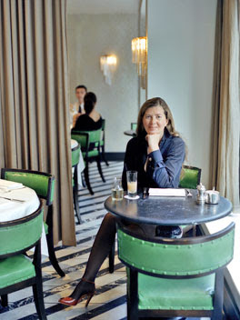
Ilse Crawford sitting at one of her commercial space design via belle vivir blog

London-based Interior Designer Ilse Crawford predominant aim is to make usually cold architecture warm and real and transform them into spaces with feelings of being there longer and fit for families.  Remember this very leading dining room designed by Ilse I posted a while ago? The space was of a magnificent size taking the main role in the house.  Well that’s because Food is in her own words is “a social glue” Nuevo Estilo magazine editors granted Ilse Crawford with “The Special Award” this year.  Well deserve!!  Crawford was founding editor of British Elle Decoration.  She is vastly recognized for her beautiful work in Retail Spaces as well as in Interiors.  If you want to see inside Ilse Crawford’s creative process, you can do that thanks to a Netflix series “Abstract: The Art of Design” that gives viewers access into the minds, worlds and processes of designers.  The world would be so uninspired if all Designers decorate the same way.  Don’t you think?  Think about it,  inspiration comes from what intrigues you from what makes you question the ways and forms of that particular style.  If every building and every house has one same style then life would be quite boring.  That’s the main reason I always admire designers who listen to their hearts rather than what’s trendy.  They create spaces entirely personalized and unique!

Read More…

It’s a brand new week and it’s been uninterruptedly sunny here in Sao Paulo for the past week, hurray! So even when I’m a little bit under the weather, thanks to my son, nothing makes me more happy than a bright sunny day! Iove to wake up early in the morning do some home-related errands and get the “what’s for cooking” out of the way and start working early. Work on my coming-soon print line and on my some-day-will-happen bijoux line. High five to the modern women who can be more than just one or two things. Actually, lately women are starting to hate labels or Bios, they have come to realized that they can be too many things at once. I include myself in that group. In another note, my sweet in-laws brought over from the US the House Beautiful December/January issue for me to see my humble contribution in it but I kept hanging on Michael Formica’s home. What pedigree, what personalization and what a beauty! I love that home like many people love their dogs or
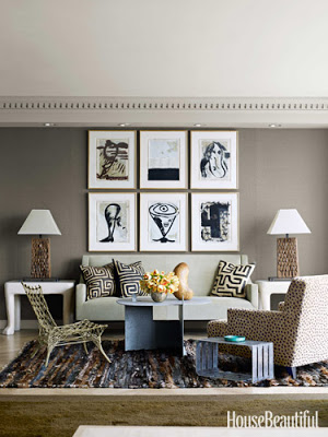
cats! Enjoy the beautiful images! The first room above, Julian Schnabel watercolors sit above and John Dickinson plaster side tables frame the sofa. An Isamu Noguchi side table and a rope chair by Marcel Wanders accentuate the very personalized feel in this living room. This room is very warm and earthy.

MIchael Formica


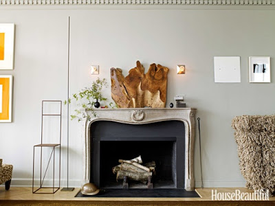
A very organic and industrial feel surrounds the fireplace.  Annabelle Selldorf’s wall lights guard the beautiful Nakashima wood sculpture.   I adore the small sculptural accessories above the mantel.

Read More…

David Kleinberg design in Manhatta via belle vivir blog

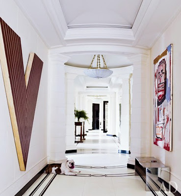
This Manhattan apartment was designed by David Kleinberg and it exemplifies what I interpret as a Chic Home.  A home with a classic architecture furnished with modern art and a mixture of classic and modern furniture.  A chic space for me is a space where things juxtapose with tension and friction,  where according to conventional thought, things are not supposed to work but they do.  This home designed by David Kleinberg is a perfect reference to it.  Enjoy!

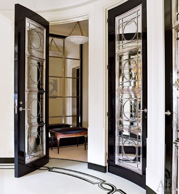
David Kleinberg design in Manhatta entryway

The design in this hallway explains more than anything of my whole idea of a “chic home.”  Classic architecture is juxtaposed with modern art such as the Jean-Michel Basquiat painting (right) and the unexpected texture of the stainless steel bench.   This a perfect interpretation of classic lines in a modern way.

Read More…

Wendy Schwartz by belle vivir interior design blog


Do you know when you’re eating something and you feel you’re satisfied but your tongue is telling you that’s too good and you have to have a few more bites?  That’s how I feel about  Wendy Schwatz‘s work.  It’s sooo, sooo gorgeous that I can’t stop looking at it and then continue looking at it some more!  Her work has that harmonious balance between edgy and livable.  Altogether, what makes me eat those extra bites!

Wendy Schwartz via belle vivir interior design blog
remember this?

Read More…

how to enhance your main door via belle vivir interior design blog

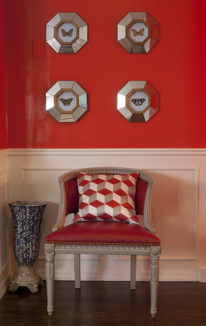
 My small foyer Photographed by Robert Levi

I wanted to show you this picture above first so you can see the wall color through a professional lens.  This is the continuation of the left wall below.  Although the pictures below doesn’t do it justice… It really looks much better in person and I wanted to share with you one way about how to enhance your main door.  I was looking for a color dramatic and impressive and I found those qualities in this striking red.

Read More…

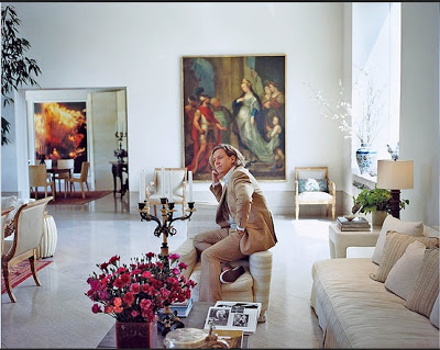
Michael Smith living room via belle vivir interior design blog
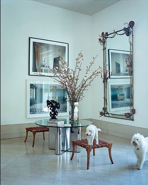
Michael Smith is well known for his very traditional style.  I was happy to see in Wall St Journal Magazine this weekend the marvelous work Smith did with his new home.  This home showcases a mixture of modern architecture with transitional and classic furniture with a few modern pieces in a more spare but still warm ambiance.  I especially love the old paintings contrasting with modern floors and white plain walls.  This is a stunner!
Michael Smith entryway via belle vivir interior design blog

Read More…