I’m thrilled and happy to see my work featured in the new issue of Rue Magazine. It’s always so rewarding and encouraging to see when a lot of work and effort pays off. Thank you Crystal and thank you Julia Millay Walsh for the fun interview.
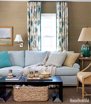
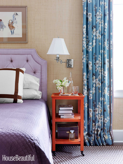
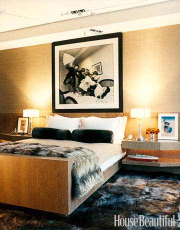
I’m happy to have been contacted by House Beautiful to write a post on Grass Cloth a week ago and very honored for the mention that will appear in the December/January issue. If you have an iPhone you’ll be able to link to Belle Vivir through the HB Connect app. It’s amazing how dynamic and personal magazines have become. House Beautiful was kind enough to send me the article so I can see it and new watermarked images that will appear in the December/January issue. Kevin Isbell knew how to make this1930’s center-hall colonial home current by injecting warm and intrinsic details such as geometric trims to floral curtains, gross-grain ribbon tape to a plain white sofa and visually connecting two separate rooms by custom painting grass cloth walls the same color as the ceiling. “Grass cloth has a warmth that paint does not, and darker colors are more cocoon-like” Kevin Isbell.
I love the contrast between the modern looking cocktail table and the wicker basket in the family room. Notice the detail of the tape on the sofa. It’s all in the small details that slowly reveal themselves to you. In this room the grass cloth used is a bit more textured than the one used in the bedroom above. A very applicable difference, I think.
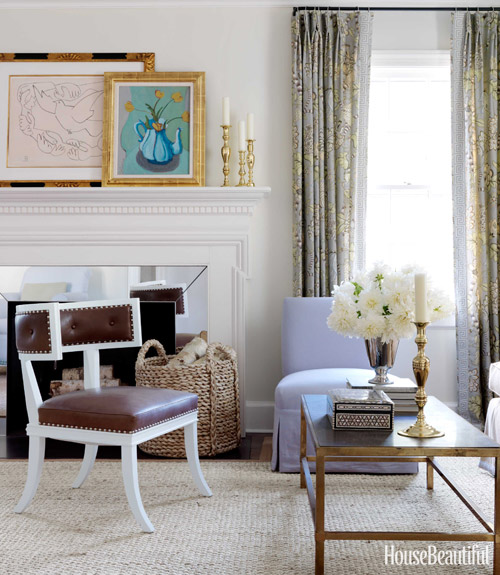
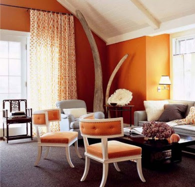
You know how I feel about any klismos and klismos influenced chairs. It’s forever my favorite chair. And the contrast here between the lilac slipcovered chair and the leather brown on the klismos chair is the perfect union of masculine and feminine. I didn’t want to spoil the article so I’m only posting the three images above, the two below are from Isbell’s website.
I said it before and I’ll say it again, the versatility of grasscloth wallpaper is indisputable. It adds coziness and texture to a bare wall almost instantly while the natural fibers provide a home with that perfectly imperfect patina. I have used grasscloth wallpaper a few times in different projects, including my home and its easiness to either glam up or glam down a room never fails to surprise me. In the second image below, the use of white washed wood, lush fur throw and seagrass wallpaper make the entire ambience glamorous and velvety. Long gone are the days when this type of wallpaper would only be available in solid colors. Now you can find them with all types of hand printed patterns. Ideal to take it all up a notch!
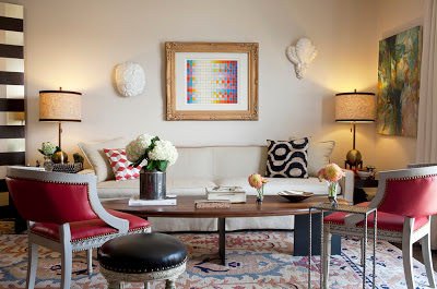
Our home after is a result of all I believe in and stand for. Uniqueness, individuality and comfort. A mind of ones own. It’s a home that reflects our lifestyle as much as possible. It’s rooted in the classics but in a relaxed and young sophisticated way with modern and transitional elements. I strive to be creative and unique so this home does not look like any other home because then it wouldn’t be our own. I like to incorporate modern pieces and/or modernized classic ones because that’s what I consider chic. A home with some modern and/or relaxed mood. I actualized the classic fauteuil arm chairs by upholstering them in red leather and embellished with brass nail heads. I did the same with the black stool. I fell in love with the coffee table thanks to its sculptural lines, another design element I constantly praise about in this blog. It weights like a forced marriage because its legs are solid steel. Every time I look at it, good memories come up to my mind remembering how my father-in-law and I carried it inside the house. I’m just glad no one called the police on us suspecting we were carrying a dead body. I bought the lamps at Gilt Home, excellent delivery time by the way, I added a trim of velvet to the shades to enhance them further. The abstract painting is a bartered piece, really! The sofa is Paul McCobb with a slip cover and the oushak rug is from ABC. The painting above the sofa is an Agam, bought at The Antique Garage. I hope you enjoy a tour of our home after…
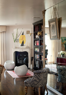
The fireplace behind the watercolor painting is the TV enclosed in the wall. The bookcase is from ABC, the drop shaped stools are form Brookstone. The brass swing arm sconces are from Shades of Light.
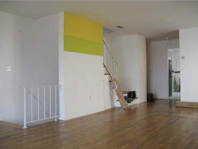
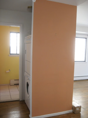 In the back you can see the powder room and the insane and unnecessary
closet in the middle of everything not only taking precious space but
also displaying the washer and drier for everyone who came in and out of
the bathroom. Nuts, right?
This is how our home before version looked like before we started remodeling it. Light, yellowish floors, two small closets on either side of the living room blocking the nice view, a less than attractive fireplace, a closed-in kitchen and completely bland bathrooms. Our labor of love was done in two separate times, kitchen, floors, closets were removed and painted before we moved in and the remodeling of the bathrooms were done two years after while living in it. Tomorrow I’ll show you the after pictures!
I covered this wall above with mirrors and framed it with two architectural columns.

