Tag: Julie Paulino Design

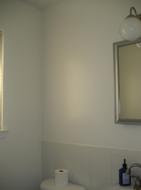
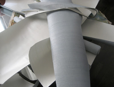
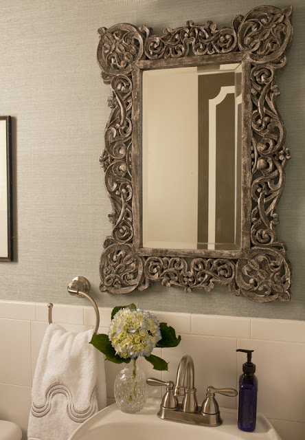
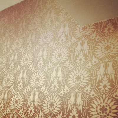
Our powder room was the only bathroom that didn’t get gutted and redone. It would’ve been a lot of fun. This is usually the place where designers choose to go wildest. Maybe in the future we’ll do. Although I have to admit that’s far from happening. The only thing that came down was a ridiculous vanity cabinet, I don’t thing we need a medicine cabinet in our powder room? To our timing all this bathroom needed was wallpaper, in this case the remnants from Lucas’s bedroom. Didn’t I get lazy here? That’s the beauty about seagrass wallpaper; it is highly forgiving due to lack of a pattern, and the natural texture of the grains fit flawlessly together and it also hides many imperfections on the walls.   Since I’m a little bit useless when it comes to DIYing, I hired a professional to do this, even when he was dealing with remnants- which is exactly the reason why I did it. The wallpaper was installed in thee of the walls and the one across from the mirror and toilet has a gallery wall from floor to ceiling. The result is totally flawless, even I can’t tell where the seams are. Go ahead don’t throw away those remnants!  Below, how to transform a powder room with wallpaper remnants.

how to transform a powder room with wallpaper remnants via belle vivir interior design blog


how to transform a powder room with wallpaper remnants via belle vivir interior design blog


how to transform a powder room with wallpaper remnants via belle vivir interior design blog

This is the after shot.  The mirror is from Anthropologie and the towel is Pratesi, bought at a sale.

Read More…

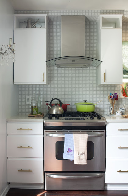
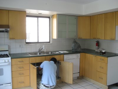
While thinking about what to post today, my kitchen renovation before and after came to my mind.  Since we’re soon moving to another country (Sao Paulo) I feel it would be great to show how I renovated our kitchen. The second picture below shows how our kitchen was before.  Very unattractive!  We teared down everything, from the cabinets to the walls, got rid of that double tray ceiling and redid the floor.  My vision was to create something charming instead of modern because this house was built around the 80’s when there was absolutely no reference whatsoever to any period architecture.  So I decided it would look like something between old and au courant.  I hope you enjoy my kitchen before and after Julie Paulino Design.

kitchen renovation before and after, julie paulino design, kitchen before and after

I love the subtle shimmery of the mosaic.  I added mirror on the back of the upper cabinets to create light reflection.

kitchen renovation before and after, julie paulino design, kitchen before and after


Read More…

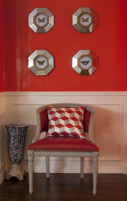
how to enhance your main door via belle vivir interior design blog

 My small foyer Photographed by Robert Levi

I wanted to show you this picture above first so you can see the wall color through a professional lens.  This is the continuation of the left wall below.  Although the pictures below doesn’t do it justice… It really looks much better in person and I wanted to share with you one way about how to enhance your main door.  I was looking for a color dramatic and impressive and I found those qualities in this striking red.

Read More…

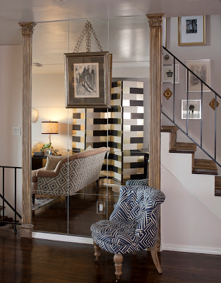
The first picture below is not the best picture of the folding screen I’m referring to, but you get the idea.  How to make a folding screen:  I believe, correct me if I’m wrong, there is no standard size for the width of the panels of a folding screen,  but there is a need for the thickness to be at least 1-1/2″ in order for the screen not to tilt over.  I had the frame custom made (cut-assemble-paint) by my carpenter and then I wallpapered it myself.  Now, here is the trick of how I did it.  To make the entire process a lot easier for me I asked my carpenter to make each panel the same width as the wallpaper.  That helped me to avoid cutting the wallpaper along the sides, which is very complicated and time consuming.  The size of the screen is 7′ tall with four panels of 20″ wide.  I liked the Block Wallpaper by Erika Wakerly in brown, gold and beige.

how to make a folding screen via belle vivir interior design blogI can’t believe that exactly four years ago we moved into this house and started remodeling it slowly.  And just when it’s finished it’s time to pack up and move to another country.  I look forward to moving to Sao Paulo and start designing our new home.  Nothing like having complete autonomy when decorating a home.  Below are two more shots of vignettes in our home.  On a separate note, the genuine and sweet Ada from Classiq invited me to be part in her beautiful Chic Files series and I’m more than flattered.  If you want to see me pretending to be an important person and answering a few fashion-related questions and wearing my loving stripes then head over there.  Enjoy!

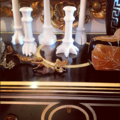
In case you’re interested.  Above, an ebonized inlaid commode from Italy and it’s from Lerebours Antiques at E 60th St.  The alabaster candle sticks are by Jardins en Fleur, the Greek key base is a Home Goods find, the brass sculpture, the marble lion sculpture and mirror are from a local vintage store.

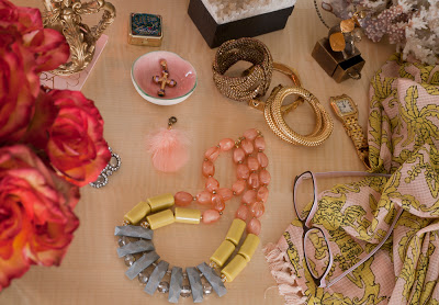
A vignette of my vanity.  The necklace and scarf are from Anthropologie, the cross is custom made (my mom’s), the coral and the pill case are from Turkey,  two of the bangles are from C. Wonder and the one next to the watch is from the Antique Garage Flee Market.

Read More…

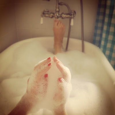
It’s Tuesday already but I’d like to share with you a brief sneak peak of a project and snippets of our weekend, which was all about relaxing and walking.  We visited a family member who just had a baby boy.  What a cutie! And then it was all about hanging around and spending some time for myself while enjoying a bubble bath.


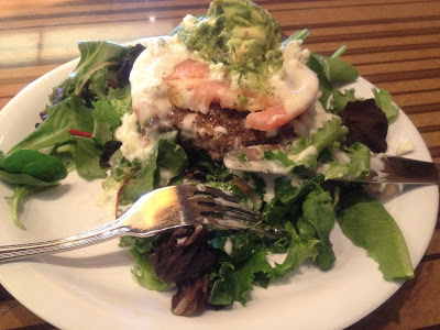
I’m often low in iron so there is always the perfect excuse to have an open burger.  Bobby Flay makes the best ones.

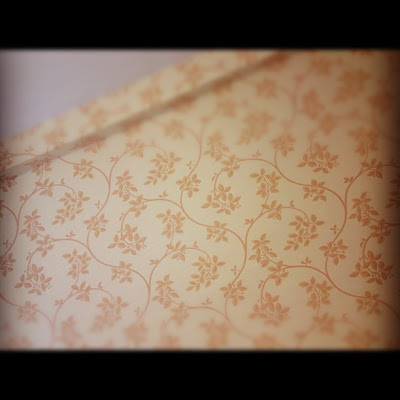
Images of a project I’ve been working int he City where we
decided to use Ringwold for the bedroom (above) and Renaissance for the
entrance.

Read More…

Lucas's bathroom reveal before and after


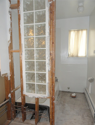
I almost forgot to take before pictures of our little one’s bathroom, but this is how it looked during midst of demolition, after removing the floor tiles some of the walls and the pedestal sink.  At that point my light bulb went on and I finally took one picture.  We gutted it down to its bone and re-configured the water pipes in order to install a pedestal tub.  I wanted to create a more of a nautical/bohemian/young atmosphere with some traditional reference.

Read More…