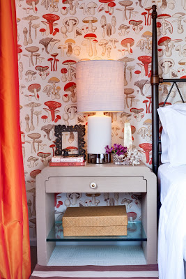
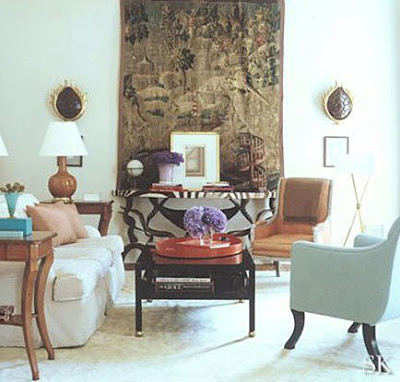
There was a little bit of misunderstanding with yesterday’s post. Apparently some lovely people thought that the first image was part of my home, it’s not. I found the image at New York Social Diary. The post was intended to inspire a different way to approach Christmas Decoration. I apologize for the confusion. For that reason I decided to post a few images of our home, which I don’t do much because we all know that magazines would not be interested in featuring somehing that’s been already published. This past Saturday the photographer Marco Ricca was here and took many lovely pictures of two of our bathrooms, the guestroom and Lucas’ room. For the guestroom above I wanted to create a magical space that was cozy, inviting and dreamy. So my first thought was the movie Amelie. Since I love French movies for their lightness and happiness underlined I designed our guestroom inspired on Amelie, hence the whimsical and unique wallpaper and the color scheme. The wallpaper is Champignons by Brunschwig and Fils, the side tables are designed by a Karl Springer apprentice. I don’t remember his name. The handle is one sculptural gorgeous thing but you can’t appreciate it much unless you click on the picture an zoom in.
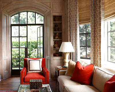
Yes, I’ll say it again. If you put in your home beautiful things that you love and that happen to also be comfortable you’ll definitely be happier in your home. Our surroundings influence our beings. Having a warm, comfortably functional and beautiful home to come back to at the end of a long and hectic day, is what we all covet. Your kids will be proud to bring their friends home and at the end of your days your home will provide an either rewarding or comforting feeling, depending on how good or bad your day has been. Enjoy!
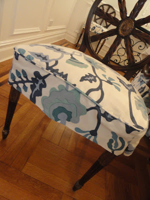
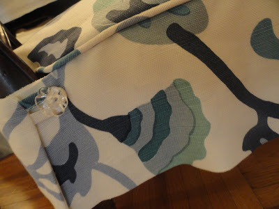
It’s one exciting thing working with a client but it’s an even more fulfilling experience when you work with a client who is knowledgeable and has great taste (she covered her foyer in David Hicks’s hexagon wallpaper- that is how tasteful she is!). When I sold the Potalla fabric here at my blog I had no idea I was going to end up working the fabric into its final state. In this case my client wanted to make seat covers for her existing chairs and I think they look gorgeous, young and modern. We also made the window treatments for the living room and the nursery room. My seamstress, who has been my friend for more than 10 years is a perfectionist and her work is immaculate. As you can see below, two separate windows in the living room where the panels are so well detailed and calculated that every geometric pattern of the Victoria Hagan fabric is aligned.
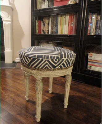
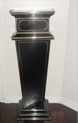
Below are two pieces that I got at a vintage/antique shop around our neighborhood. My husband jokes about me being this store’s best client because almost every other day I come home with something I find there. Remember this? You should see my garage. But hey, when you have a vision you have to have the resources… right? I don’t have an image of how the ottoman looked before, unfortunately I get carried away with the exiting outcome and always forget to take before pictures. I got it covered in “Melinda” fabric by Alan Campbell in navy on tint and embellished it with a braided jute trim I got at M & J trimming. Bottom image is a black lacquered decorative column I found buried under a few old dining tables.
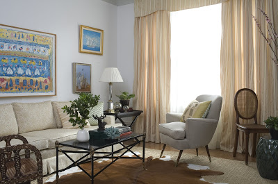
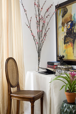
Apologies for the lack of post. I’ve been very busy adding the final touches to this project and I’ll be soon sharing more pictures with you. Here is a sneak peek of the project for eye candy.

