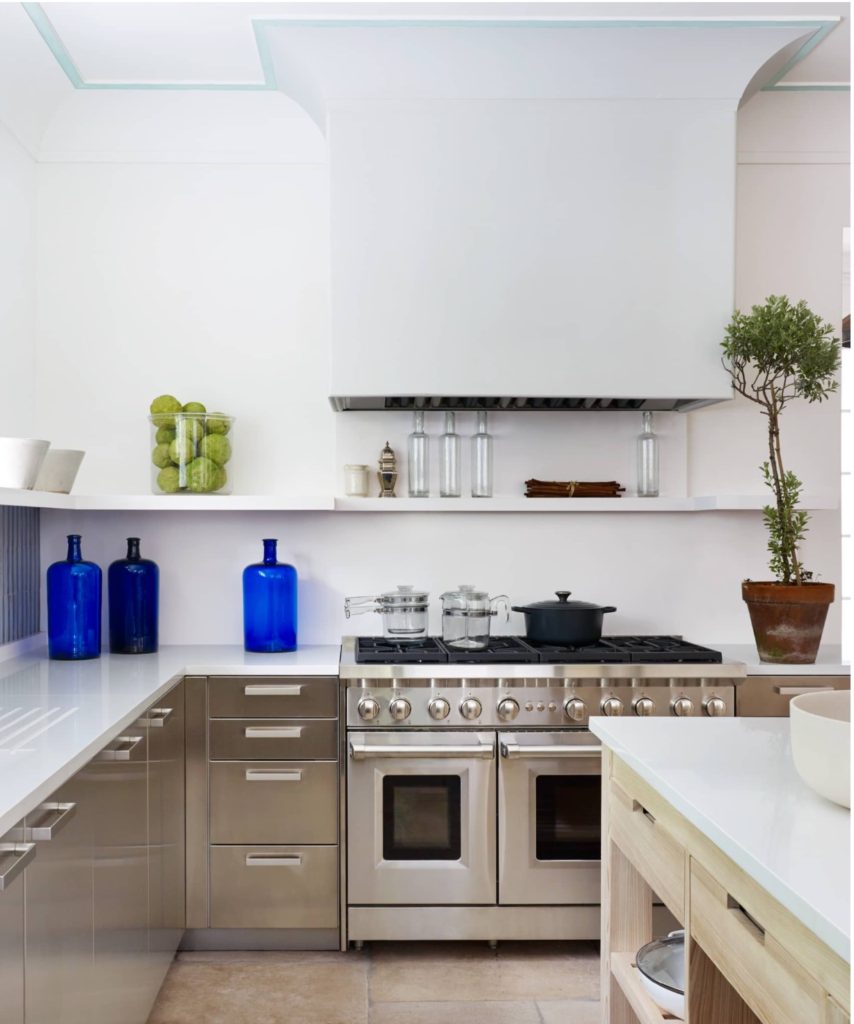
Stephen Sills Hi Low farm kitchen strikes the right balance between minimalist and transitional. His kitchen is located in Bedford, New York. After an extensive renovation that included an addition in his Farm Hi-Low, yes I believe that’s the name, the kitchen is the place where everyone visiting ends up. “I love kitchens but it’s very contradicting, because I normally don’t like anything utilitarian” Sills says. Stephen Sills has had the estate for a long time but he only took on the addition and renovation project last year… The kitchen is as stylish as it is functional with no need for excess with a mixture of raw and sleek with the raw side found in the limestone floors, raw-cypress islands and distressed terra-cotta tiles. The sleek opposite side is in the matte stainless steel cabinetry, white quartz counter top and simple few accessories. Humble natural materials mingle with man made polished ones… “No matter how many people are here,” Sills adds, “everyone wants to pile into the kitchen”.
We finally bought our home here in Dublin and the exciting stage is about to start soon. Boy, I can’t wait… The house as it is now is a complete disaster, which makes me somehow weirdly happy. Every single surface, space and room needs to be redone, replaced or updated from floor to ceiling and windows… you name it. So it’s safe to say that we won’t be moving anytime soon. And you may be asking yourself what do all this have to do with two tone kitchens… Well if you know America’s obsession with white kitchens… I thought it would be a good idea to try to do something different while still beautiful. And also because I just realized how much I’ve loved two tone kitchens for like ever…
I also realized that I favor kitchens that don’t necessarily look too much like traditional kitchens, if you know what I mean… absence of upper cabinets, furniture like islands and a more lounging atmosphere in general, etc….
Now don’t you fret… by two tone kitchens I mean a contrasting color on either lower cabinets, upper cabinets or island and it usually works out very well.
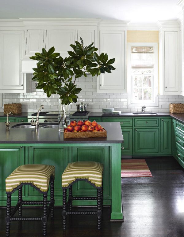
Not for everyone but contrasting colors in this kitchen are surely rewarding and unique. Green and white…
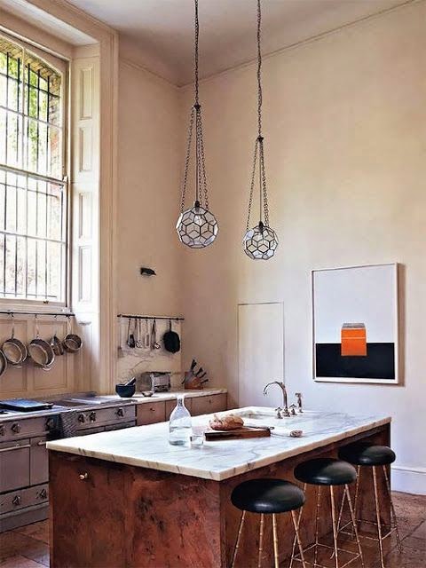
If you have not seen at least one of the refined rooms designed by Rose Uniacke then you’ve been living under a rock. Her perfect balance between the raw and the refined has fashioned her a very acclaimed interior designer. Uniacke studied philosophy and worked for a furniture-restoration workshop where she learned about antiques. The latter experience and the influence of her mother, an antiques dealer as well, honed her style and knowledge of antiques and she became an antiques dealer herself. Good antiques, the right clients and her great sense of style, light and proportions marked the path for her renowned Interior Design firm. I posted about her kitchen a few years ago. The kitchen with high ceilings, the right amount of light and absence of upper cabinets was already beautifully understated but as many other designers do, Uniacke also keeps updating and changing things around her house. In February of this year Vogue magazine showed her London home in which the kitchen has a completely different look. I can’t think of a better place to experiment than our own homes… Rose actually renovated her entire house and converted the basement into a swimming pool, and a hamam… The house also has one of the most beautiful conservatories I’ve seen. The glass-roofed conservatory is the first room you see upon entering the house…marking the serenity found throughout the house…
While searching about this black and white kitchen below, I came across the sitting area of another kitchen that looked as they belonged together, sort of like a Dream Kitchen Design.
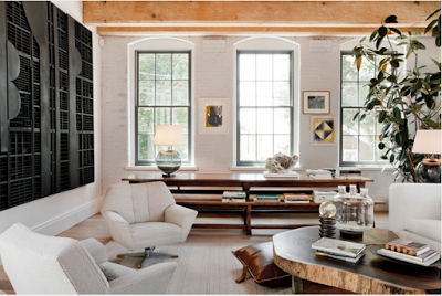
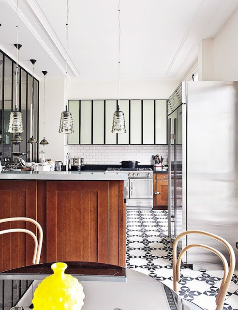
The black and white kitchen with ceiling-high subway tiles and dark grout was designed by Tamara Magel while the would-be other side of the “Dream Kitchen” with a more neutral, earthy tones was designed by Huniford. Their aesthetics and atmospheres are very similar to each other, especially when the exposed beam ceiling is a shared interior architectural detail. The shared color in both kitchens is white, especially in the first two images where white is on almost every surface except for the beam ceiling and the black range hood. This is a very relaxing and clean kitchen, however I believe that the tones in the last two images are a bit more soothing and warmer due to the use of earthy tones such as grey, browns, black and the touch of nature in the form of indoor plants. Such details make a difference when it comes to creating an atmosphere in interiors.
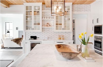
The choice of glass doors for the upper cabinets give this kitchen an open feeling. It also softens up the exposed beam ceiling.
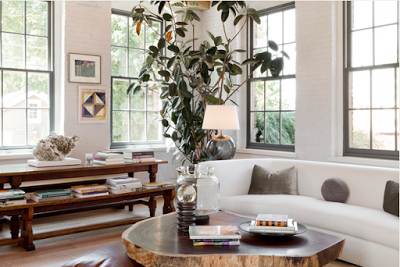
I especially love the windows in this kitchen sitting area. The details of curved edges soften up the brick walls and metal windows.
Lovely warm and modern inviting sitting space.
Two top images via Tamara Magel. last two images via Rikki Snyder.
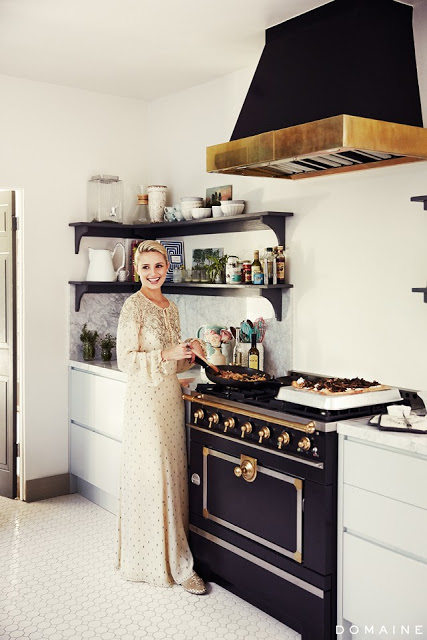
Love the regal look in this kitchen. Hexagon tiles on the floor give it an old-world feeling. The cabinets are of a very light green color which gives the black stove a free rode to reign by itself. Via My Domaine.
The thought of owning a kitchen with a black stove may make some sneer. Having stainless steel appliances as the first choice for homeowners, a black range may not sound too appealing. But once you get to see these fantastic, beautiful kitchens, all featuring black stoves, you may not only change your mind, but they might also prompt you to save some money to buy one yourself and put it in your kitchen. These stoves don’t come with a cheap price tag, though. Since they don’t always appeal to everyone, their exclusivity and rarity come with a hefty price. Expect to pay a minimum of around four thousand among the most affordable ones and up to sixty thousands for others. Since we are looking for a house in Columbus, Ohio, I’ve been contemplating different range options. My husband loves to cook, he says it relaxes him, and I cook dinner almost every day except the nights when the mood calls for some Thai takeout. My dinner cooking is effortless, baked fish which is
usually salmon, steamed vegetables and or salads. It may sound boring, but it’s delicious and super easy. I joke with Evren my husband sometimes when I suggest having the salmon outside occasionally. We are a family who is obsessed with good eating, so we like to make everything from scratch hence an excellent functional kitchen is a priority in our home. But more than me being a cooking fan, I really enjoy beautiful kitchens and watching my hubby cooking on the weekends so I thought it would be nice to have a very good looking stove in either black or another color and the only range I’ve come across with a more reasonable price is Verona, last picture. It comes in many different finishes and sizes, and the design is the result of a perfect interpretation of a transitional stove. It’s clean with not too fussy lines, and I know I will be able to live with for a long time.
It should not take you by surprise the fact that Americans love to collect, thus their love for big kitchens with lots of cabinets. European kitchens, on the other hand, tend to be smaller for the reason that Europeans tend to buy only and mostly for current consumption, instead of purchasing and freezing food for weeks. Americans love functionality and comfort, Europeans love the simplicity and no hustle. Kitchens in America usually have big room pantries where they stack up on all kinds of food. On the aesthetic side, Europeans gravitate towards no upper cabinets perhaps as a reflection of their more simple lifestyle.
American Kitchen vs European Kitchen
European Kitchens
A kitchen designed Studio Razavi