William Mclure is an Artist and Interior Designer. You may have seen his inspiring apartment many times since it has been surfing the web for a couple of years. Many sites have posted about his beautiful Birmingham apartment and its constant changes. I can’t find anything more pleasurable than seeing how artists and designers keep on changing and rearranging their homes. And they don’t do it because they get bored, no. After all who says that a home is ever completely finished. Our own taste is constantly developing and once we get more confident about our own choices in Interior Design or in anything else in life for that matter, our results are more stunning. Of course this latter gets more noticeable in someone with such taste as William Mclure. His design aesthetic is a mixture of that ideal combination of old and modern classic pieces -elegantly casual with zero stiffness. When it comes to his talent as an artist, he is all modern in a very classic way. His paintings resemble a bit of Cy Twombly with a sum of cubism.
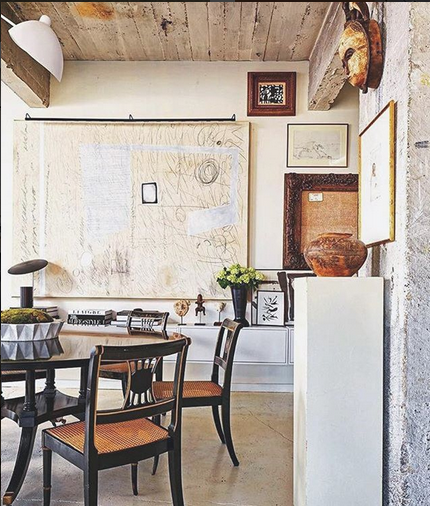
William’s Instagram account is of great entertainment. His ability to create all these beautiful vignettes is impressive. And he can’t stop still, it seems. He is constantly changing his home when he is not moving. I honestly had to spend a good couple of hours figuring out which of his apartments was the most recent one. I think I got it right though. Let’s look at them… shall we?
I think that first picture has all the goodies it needs and then some more. William got eight of the Regency style chairs for $300 bucks on Craiglist. This time his apartment has more of a global feel with exotic accessories. I love.
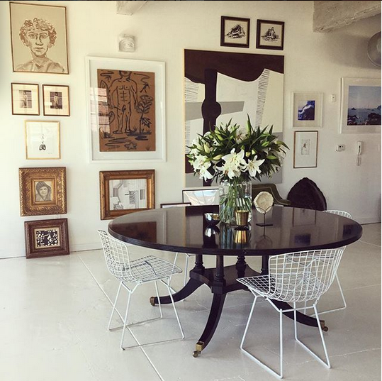
I absolutely love this space. The gallery wall is a beauty on its own but the classic black table contrasting with the white Bertoia chairs is simply stunning.
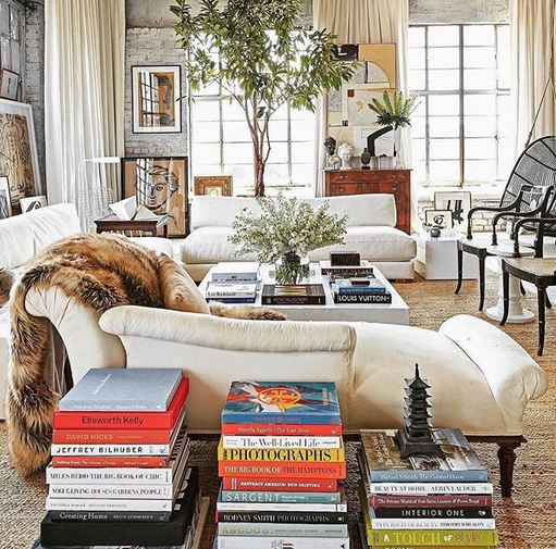
This is his new or latest living room, at least until yesterday, lol. The space is an industrial loft which William was able to make into a cozy and elegant home. Love the neutral tones and the touches of black. Every home should have a dose of black.

This time the selection of the furniture is a bit more on the modern side with more elegant pieces like the Regency style chairs.
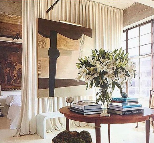

You all know I love a good before and after. This is when you can see what’s really been done. The transformation is there.
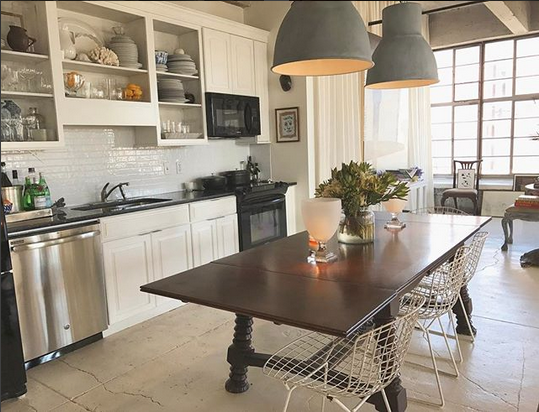
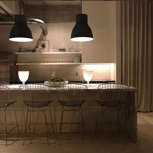
The kitchen at first didn’t change much. I think William removed a few cabinet doors added a couple of shelves inside. He even kept some of the appliances. Below though it’s the newly renovated kitchen. More open and modern this time.
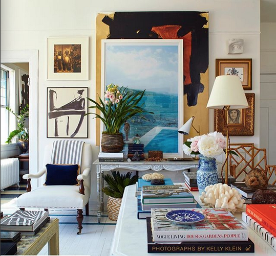
Below, is the previous apartment painted in white from the ceiling to the floor? The decor is more beachy and American classic with lots of blue and white accessories. The new loft though required a more modern approach to adapt to the industrial interior architecture of the space.
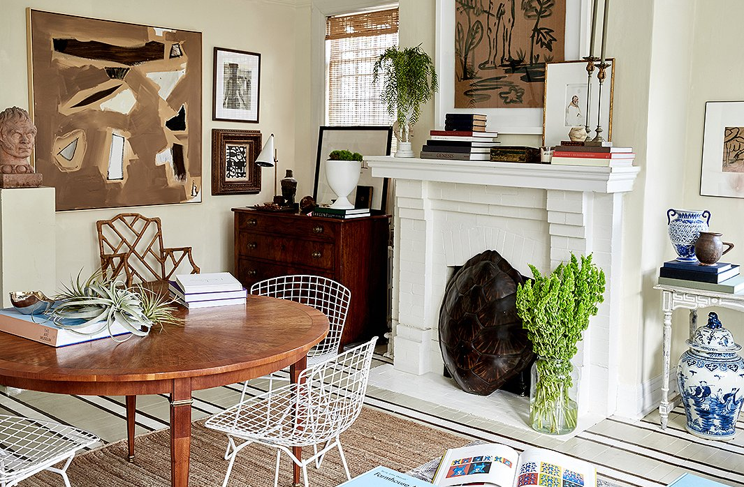
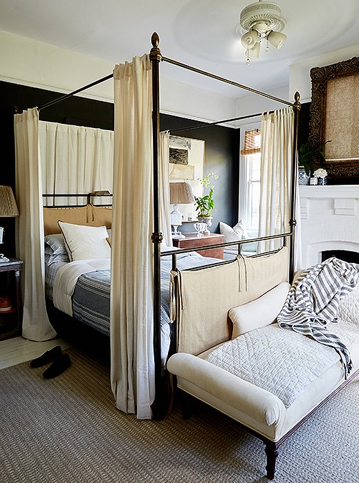
His previous bedroom painted in black. The drapes on the canopy bed and the use of white and beige soften up the space.
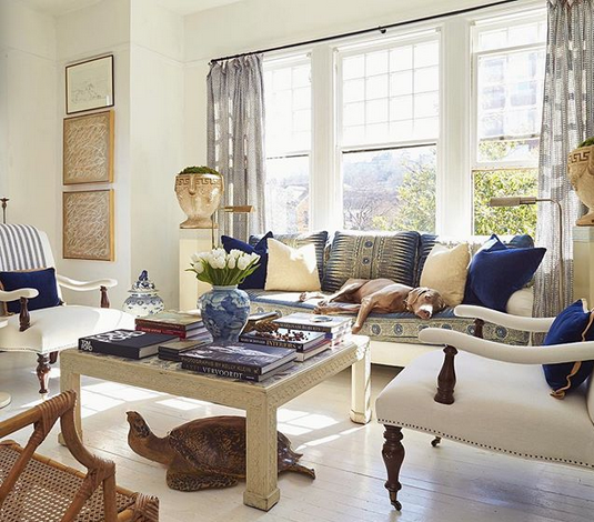
The English style side chairs got a makeover as well, as so did the sofa and the walls and the floor…
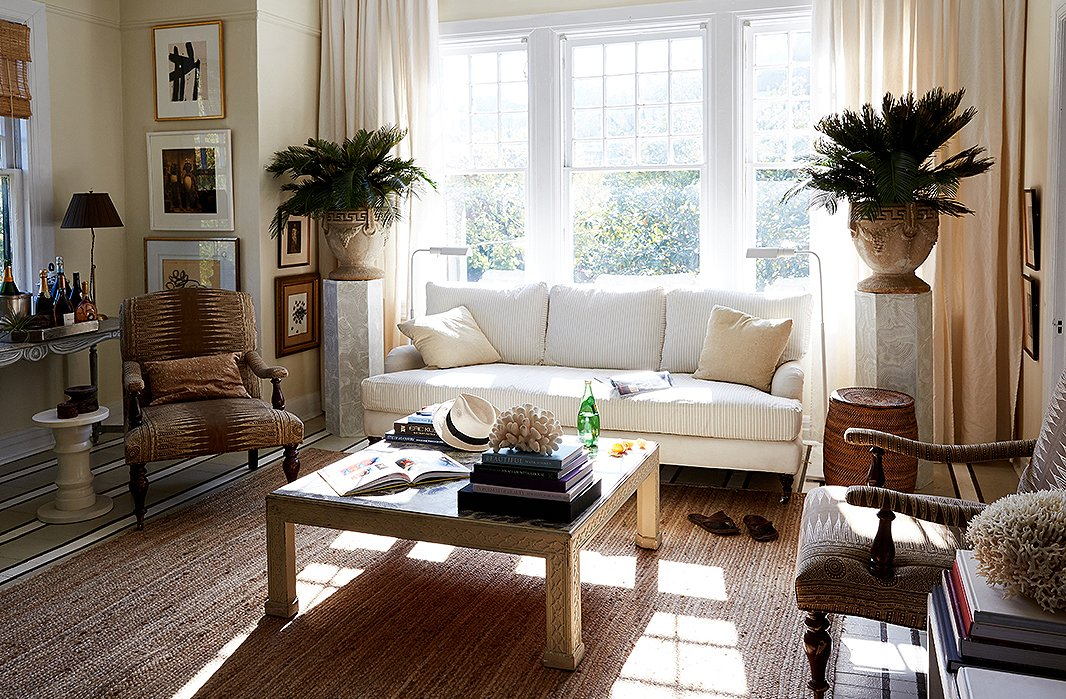
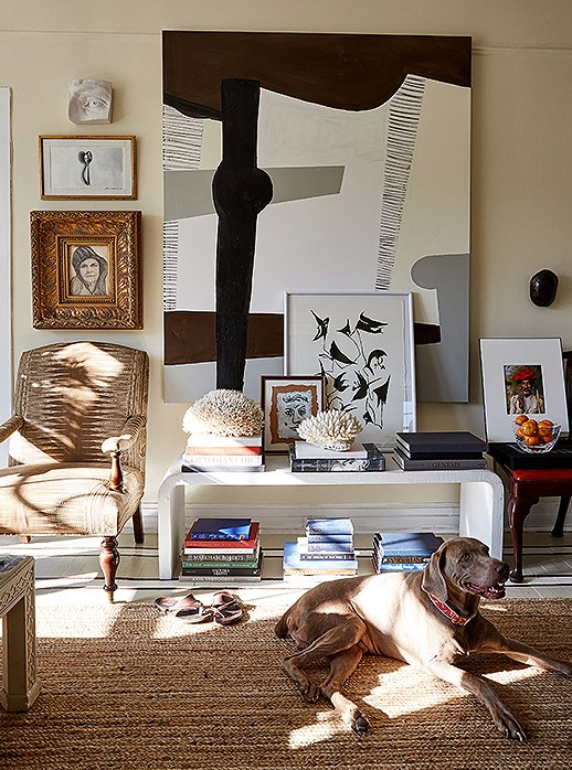
I can’t even with this stunning vignette. Perfect, perfect.
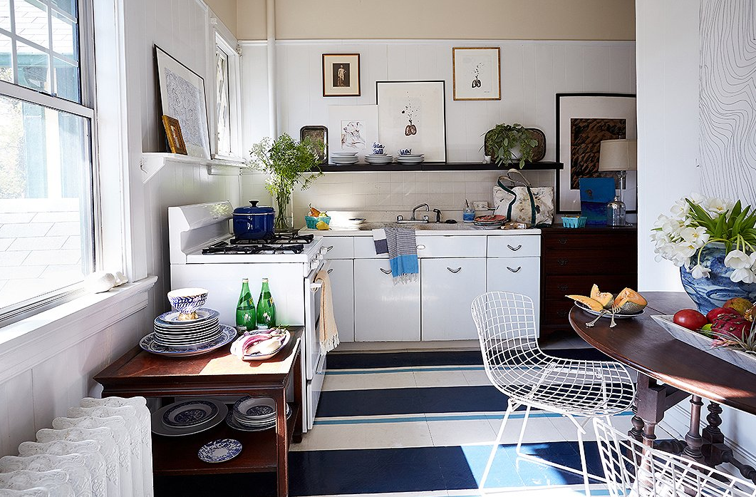
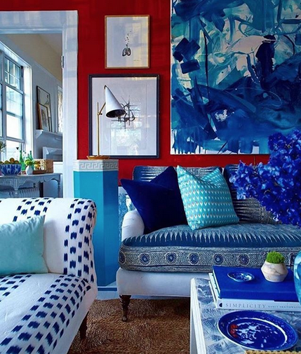
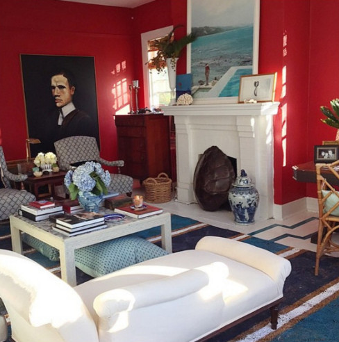
Inexplicably William might have gotten bored of all the white and started adding color by painting the living room red. LOL. He kept the blue and white accessories and brought some blue into his previous charming kitchen. Either in color or white or industrial chic, his apartment is one that keeps on inspiring.
