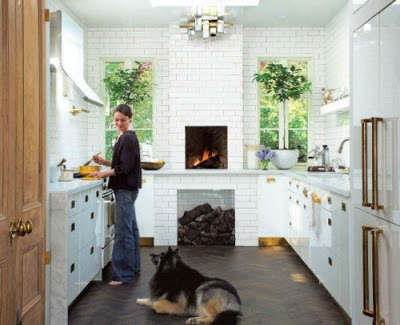
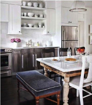
A kitchen with walls covered from floor to ceiling tiles gives the impression of being well finished. Regardless of what type of back splash is covering the walls, the simple subway tiles, marble slabs or hand painted tiles, the whole effect gives the kitchen a feeling of grandeur and cleanness. For an even more seamless appearance some people go with grout of the same color as the tiles while others who prefer a more contrasting effect decide on gray or black grout. I prefer a darker grout especially if the kitchen is all white to give it depth. There are many different shades of gray from darkest to lightest. Enjoy!
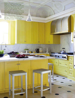
Waking up to a Kitchen with bright yellow cabinets is like being greeted with a “good morning sunshine” every single day. With such an impressive antique ornate coffered ceiling, a simple and delicate pendant is the smartest thing to do. If all the previous failed, for sure a black and white polka dotted floor will do. Enjoy!
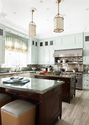
No white or natural wood cabinetry for a change in this weeks’ kitchen of the week. The decor in this kitchen that I found at Erin’s blog House of Turquoise caught my attention for its clever use of color in the cabinetry. It’s there but not in your face, the effect is almost as neutral as white or beige. I also love the height of the cabinetry. It’s smart to use all the wall space you have and make the entire area more functional and grander. You may be wondering why all appliances that one can imagine are together in one kitchen…and that’s because the owner is an apprentice chef who has incredibly good looking brass pendants hanging in her kitchen. I mean…let’s take a moment here…don’t these pendants lend a life changing factor to this kitchen?
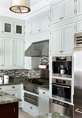
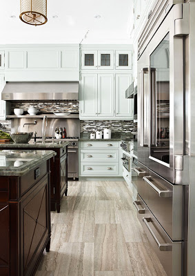
I kind of like how the backsplash looks from this angle where it adds uniqueness to the design elements. The designer Dee Dee Taylor Hannah probably thought that there’s been enough white subway tiles (something I still love regardless) in the history of design and opted for something a little bit more modern for a traditional kitchen. I’m not a big fan of this type of glass tile, but one of the things I love more about blogging is when I come across something that perhaps makes me think twice. I never get tired of things that wake up all my senses and possibilities and in this kitchen those glass tiles really make all the sense. I think that using white subway tiles in this kitchen would have probably made it one more typical kitchen.
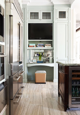
I usually do my computer work out of our kitchen table so one of the things I would love to have in my future kitchen is a work space in it to open letters, write notes and put together to-do lists… I would need a chair with back support though. Can my list get any longer? Enjoy!

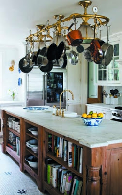
This kitchen is classic to its core but it’s not boring at all. The contrast of colors in the cabinetry makes it free of expectations. I saw this kitchen in Hamptons Cottages and Gardens magazine and I was so smitten by it that I couldn’t wait until it was featured on their website. The contrast of colors in the cabinetry and the multifunctional island makes this kitchen stand the test of time stylistically speaking. The hexagonal marble floor tiles with black florets give it a very European touch. Of course I don’t have to say that the utilization of brass used throughout this kitchen makes me happy! Enjoy!
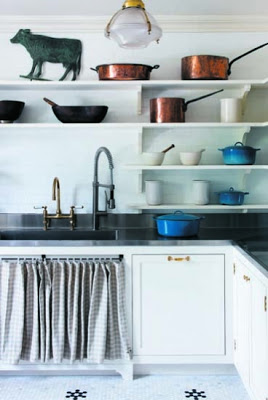
The modern side of open shelves, stainless-steel counter top and faucets of two different finish say there is something interesting about its owner’s sense of style.
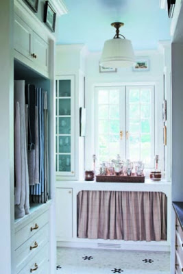
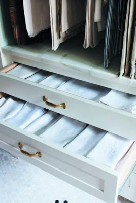
A kitchen that has a butler’s pantry this big and well organized where all the linens are neatly hung on hangers and/or folded in drawers would be any housewife’s dream.
All images from Hamptons Cottages and Gardens
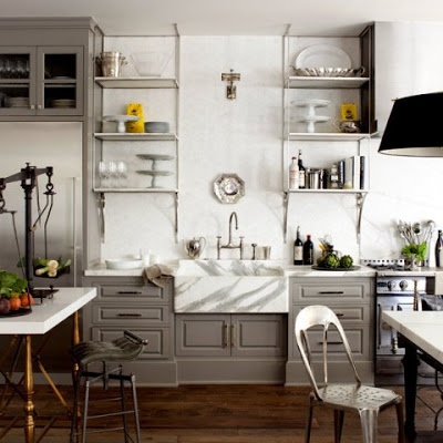
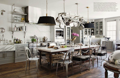
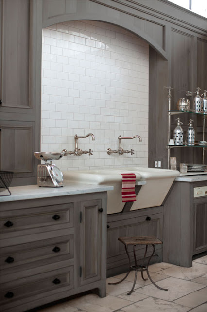
Ever since I saw this kitchen at the current issue of Veranda Magazine I was taken by it. Windsor Smith, the designer, incorporated industrial elements in a classic background to create an open, grand and unique kitchen. The first thing that caught my eye was the balance scale on the picture above. Isn’t that an exquisite detail? For crying out loud Windsor, God Bless you! Then of course my eyes started to get bigger as I was trying to get everything in. Let’s talk about those gray cabinets, how seamlessly they blend with the carrara marble that is used abundantly throughout. Oh! and that sconce in the middle of the open nickle shelves, oh my! Talking about layers, texture and interest, the wall behind the shelves is enveloped in hexagon marble tiles, really?! Now moving on to the floors, I can see kids coming in and out riding scooters and roller blades and the floors would only get better. This kitchen is an absolute antidote to boring. If it were a brownie I would have already ate it!
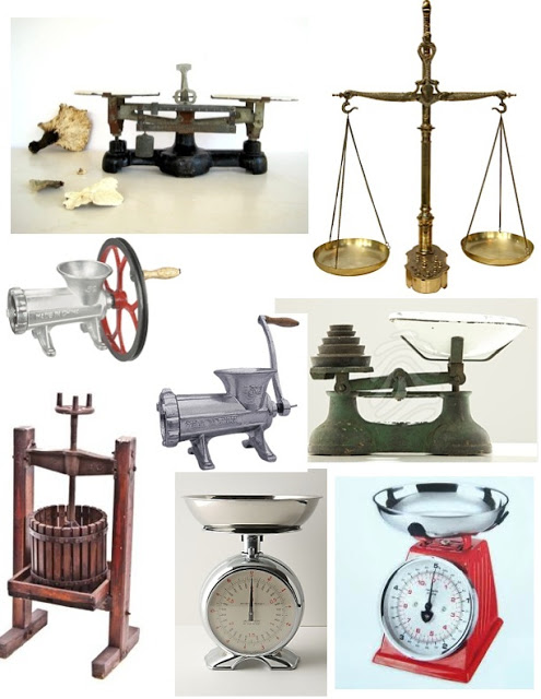
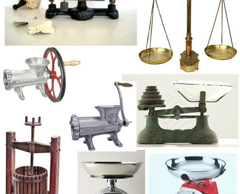
I suspect that we are going to start seeing touches like the balance scale more often and more frequent. Below are a few traditional kitchen utensils and industrial accessories that I think would look great in any kitchen. Many of them can be found at restaurant suppliers.
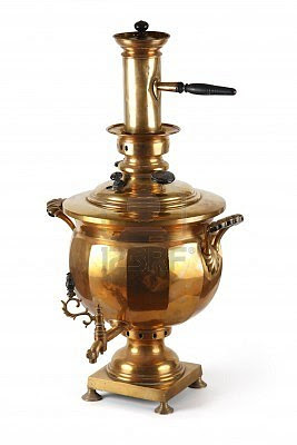
Clockwise, from left top corner, Antique apothecary balance scale at Etsy, Brass balance scale with weights at 1stdibs, old scale, white at Anthropologie, 19th century American wine maker at Urban Remains Chicago, and meat grinders. Below, a Russian antique samovar.
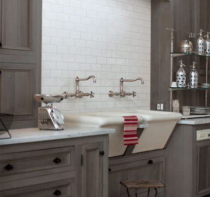
This kitchen caught my eye for many reasons but especially because of the clever use of the sinks. I think that having opted for smaller and more conservative sinks, the outcome would not have been as original. Interesting how only one well planned detail can make such a difference! Enjoy!

