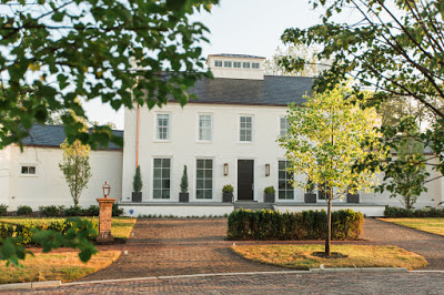
It’s always inspirational to see home renovations resulting in unique stylish spaces, as is the case of Emma Jane Pilkington’s home in Greenwich, Connecticut which Emma shares with her family. After living in Paris and New York, Emma, eager for more space, moved to Greenwich, Ct. with her family. The house had major flaws that needed serious work. Small rooms, low ceilings, and tiny windows were among those. The massive undertaking took three years and the help of architect Joel Barkley, who also did an addition that serves as living and dining area. The interior decor is composed of great antiques, cozy upholstered furniture and 17th and 18th-century marble fireplaces. Some of the furniture pieces came for Emma’s previous apartment in New York, which I previously posted here. The result of this new dream home is the right balance of European meet American style, worth enough to leave the City for. Below, Emma Jane Pilkington Greenwich home.
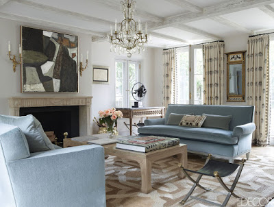 Custom sofas covered in mohair in the living room
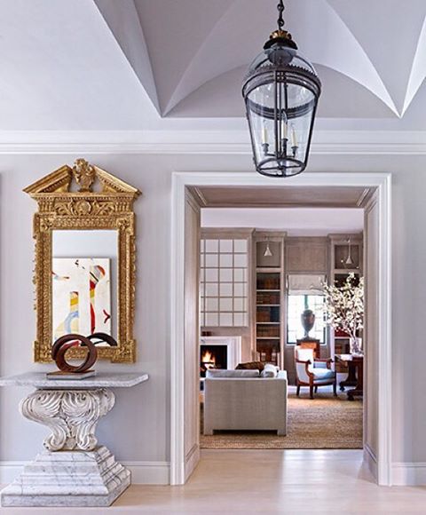
Many of you may have already seen this home in Houston designed by Bruce Budd in collaboration with Bute King Architects, previously featured in Architectural Digest. The Georgian style home is redecorated portraying a quintessentially Bruce Budd style, elegant and classic with modern touches in the form of art. The relaxed but elegant atmosphere of the decor throughout the home was the response to the homeowner’s request for a home with a welcoming environment to entertain his grown children and grandchildren. The transitional style is timeless and up-to-date. The home’s casual and relaxed but still formal decor is thankful to the mixture of expensive antiques, modern art and humble materials as woven straw, linen, cotton, materials that are usual staples of Budd’s design. To give the formal home a sense of lightness, Budd limed the Louis XV boiserie paneling as well as the floors and millwork throughout the house.
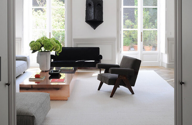
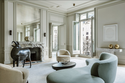
If I was not an Interior Designer, Joseph Dirand would be the one designer who I would give complete authority to do my home. But of course I don’t own an apartment in a 19th-century Haussmannian building on Avenue Montaigne, nor am I heiress to an Eastern European
fortune, so I could never afford such a talent. Joseph Dirand’s latest project is a 6,500-square-foot abode with all the amazing details of French design such as perfectly restored moldings, parquet floors and 11-foot-high double doors. Details that the talented Architect knows how to enhance without letting them take center stage to create the ultra-modernist/minimalist designs he is well known for. Dirand was also in charge of assembling the art collection. Everyone of Joseph Dirand’s projects display refinement and sophistication in a very restrain way, a style characteristic of French Designers. As in this apartment can prove the attention to detail is in every space and furniture.
A Francois-Xavier Lalanne sculpture in front of the marble fireplace. The curves in the furniture harmonizes the square moldings and stone console and the soothing tones are elegant instead of chichi.
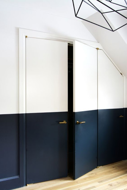
European Design is very different from American Design. It’s simpler yet stylized, restrained and unpretentious. European interiors is more about how the furniture complements the already elaborate Interior Architecture. And when the interior background is modern enough, they find ways to enhance them in unassuming ways. One simple but powerful way to add architecture to a modern room is by adding a different color paint to half of the walls in a room, haf painted wall. This half and half painting interior design detail can be done by painting the room walls in light color and then adding a dark color on the half bottom side of the walls in a straigh line. As the images here show, the dividing line can be added at any height you wish. This is a perfect way to slowly bring dark hue inside our homes when we are too afraid of putting it in the entire room. It’s also a smart way to add a focal point to any room.
7 Half Painted Wall Ideas
If you are a regular at Instagram then without a doubt you’ve seen the Pink monochromatic restaurant, The Gallery at Sketch, designed by India Mahdavi with artwork from British artist Turner Prize nominee David Shrigley. Shrigley’s recognizable drawings are also present in Sketch’s original ceramic tableware which can be purchased via the restaurant’s website. The Restaurant which also functions as a gallery, hence its name, has velvet pink banquets and Mahdavi’s emblematic curvaceous chairs that seem to float over chevron multi-colored tiles. Reminiscent of the all-time Hollywood glam era, the pink room is accentuated with touches of rose gold throughout. The mixture of the artwork and the exquisite design makes it a perfect place for Art and Design enthusiasts.
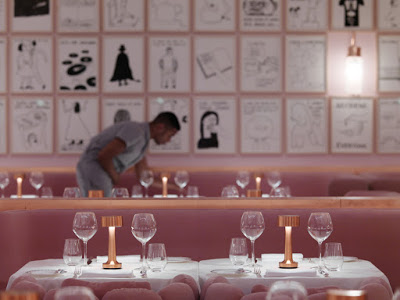
Architect and Designer India Mahdavi’s work is as popular as it gets. Named by Architectural Digest as “the reigning queen of color” for her use of bold colors in her projects. She attributes her boldness to her international upbringing. She was born in Tehran and raised in America, Germany, and France. Hotel Thoumieux in Paris is also presenting one of her creations. Read More…
upper, but the neighborhoods in Dublin are mainly new developments where there are not many fixer uppers. The homes are also fairly cookie cutter and the layouts are really
embarrassing, and lastly I don’t want to go through the long process of building a new home with our home-base in the East coast where I hope we end up not too far in our future. There are two things I won’t compromise on when it comes to choosing a home. First one is
trees, where I want a home on an old school setting therefore I would like to stay away from new developments. Second I want a bit of distance between mine and my neighbors homes although this last one seems a bit tight. While perusing homes for sale on
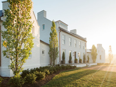
Zillow and Trulia I came across a very classic builder called Kevin Knight and Company. They are located in Powell, Ohio and their homes are breath taking. This is what it says in their site. “We pull inspiration from the land, including the raw elements that are painstakingly extracted from it. We marvel in nature’s fragile balancing act, respecting her constant ebb and flow, which often influences our decisions about architectural placement and form. Natural materials, from slate and stone to hardwoods and flora, are intentionally employed to bring the outside in, while we incorporate new ways to integrate indoor luxuries to open air environments.” Sounds like the real deal to me.

